At first, I thought it was pretty cute — as cute as anything can be in the middle of the night on a New York subway platform abandoned by all trains and gods. The little illustrated alligator looked at me with a mix of fear and surprise. It accompanied a message from the MYmta app, essentially telling me it had no earthly idea how I’d get home.
I was somewhat charmed until I realized that this lil’ fella (who isn’t the mascot for the MTA but instead an “illustration… associated with the app’s error screens,” per the MTA via a Twitter DM) was really an attempt by some hired PR agency to distract us from the reality that public transportation — one of the most important parts of any plan to halt climate change or help shift inequality in urban spaces — is generally run like a ramshackle Chuck E. Cheese. (Is anything, apart from the subway system, more widely accepted as a public urinal than a ball pit.)
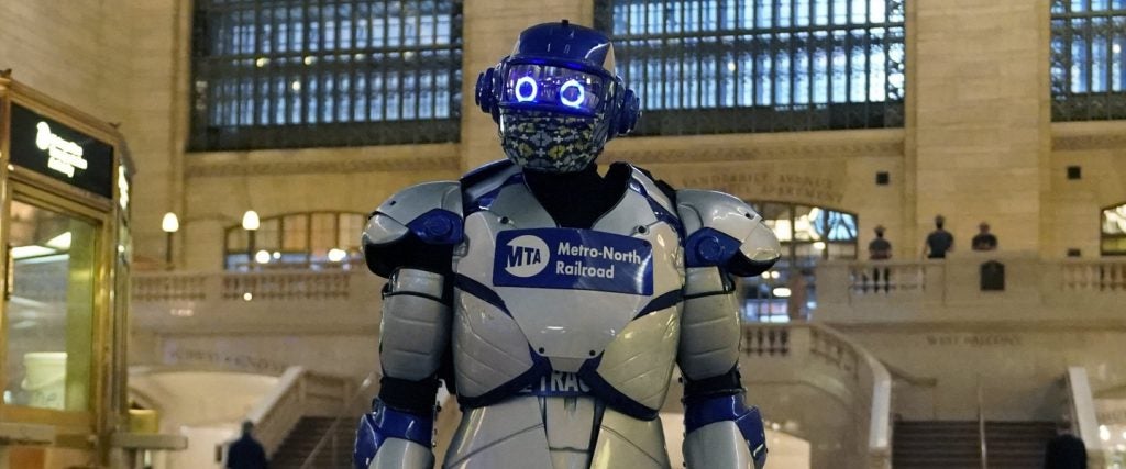
And while the MTA has generally shied away from mascot-based distraction tactics, that’s not true for the Metro North train that services upstate and parts of Connecticut. That has something called Metro-Man:
Probably developed in the early 1980s to get kids who liked Star Wars into riding on trains with suburban stockbrokers drinking huge beers on their way home from Wall Street, the mascot faded into obscurity in the decades since. Recently, however, it’s reappeared with a redesign into something that I can say without any hesitation is deeply chilling.
His cursed eyes and rictus grin answer the question of what would happen if you made a robot whose prime directive was to tell you that yes, you are having fun at Electric Zoo. There was also the brief moment where the MetroCard rollout would’ve brought us the truly magnificent Cardvark, but sadly, he was obviously too beautiful to live.
New York City is an anomaly, though, as most transit systems in the U.S. employ one kind of mascot or another — each horrifying in its own way.
Living Logos
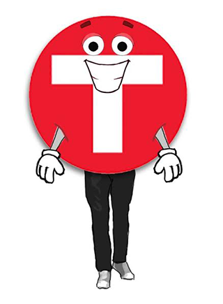
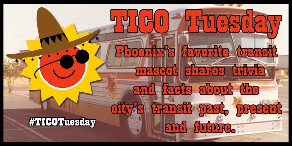
The most benign mascots tend to be the most abstract: Both Metro Transit in Minneapolis and Valley Metro of Phoenix have used anthropomorphized versions of their own logo. Metro Transit’s Skip Traffic is essentially the face of a person who just thought someone waved at them when in fact they were waving at a person directly behind them. Valley Metro’s now retired Tico’s worst feature is that it looks a little like if the 7 Up Red Dot spent a weekend in Tijuana with his frat. Unfortunately, they’re outliers.
Public Transit Come-to-Life
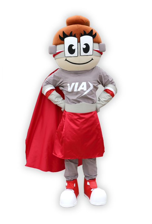
Where things really start to get uncomfortable is when you get to the most prominent type of subway mascots — the train or bus come-to-life. These Transformers on Prozac are supposed to make you think that trains are cool and friendly, but instead, they always give me the feeling that public transport wants to eat me. San Antonio’s triumvirate of mascots for their Via System seem harmless at first, but the longer you look at them, the more you think of them as a poly group that wants to get you into a hot tub filled with motor oil.
And you know that Rails of the Houston Metro system — a mascot with a drug dealer’s name if I’ve heard one — will be the face you see when you wake up in a trainyard tied to a table while he talks to his friends about how you haven’t eaten until you’ve had liver fresh out of a body. Finally, the Bartmobile from San Francisco, hands down the most disturbing of these monsters, is basically what you’d get if My Neighbor Totoro was about vore.
People in People Suits
Though I will see many of these train mascots in my nightmares, a special place in the darkest part of my brain is reserved for the mascots that are people in people suits. These simulacra of our friends and neighbors represent the most deranged in motor vehicle PR. Charlie of the MTA, for example, is freaky enough with his gigantic face and attire that looks like what you’d get if David Byrne shopped at Men’s Warehouse, but his origins make him even creepier. Charlie’s name comes from a song which, admittedly, is as much of a banger as you can get from the Kingston Trio, but revolves around being trapped on a train for all of eternity.
Then there’s also the human-styled mascot from my hometown of Seattle. I’m very sad to say that he sucks — real bad. Zap Gridlock is some sort of gladiator-astronaut hybrid, and he makes me want to cry both in sadness and fear.
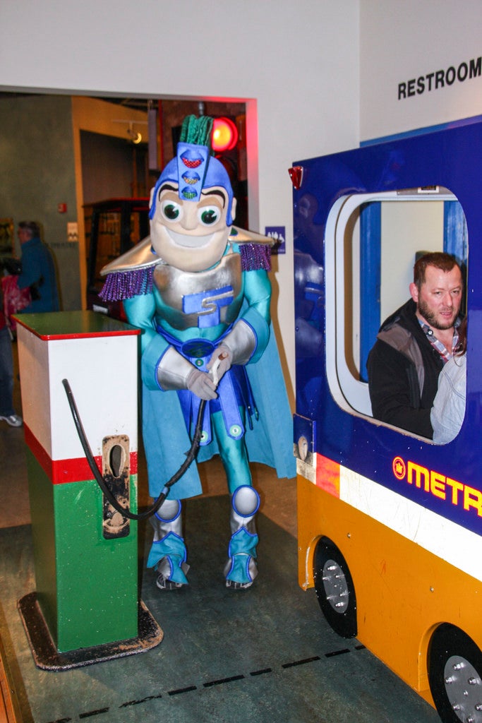
When compared to these otherworldly beasts of public transport, with their uniform smiling faces and evil, evil eyes, my little alligator buddy is actually looking pretty good. While other mascots present an obviously fake, serene outlook on the necessity of getting around a city, this little dude advertises a much more realistic experience. Like the rest of us who put our lives in the hands of underfunded and mismanaged public transit systems, he’s a little scared, a little humiliated and a little surprised that someone is paying attention to him at all.
