Five years ago, when he was a 15-year-old sophomore in high school, Tino stumbled upon a revelation that would change his life forever. The problem was, it was also sure to be a source of endless derision.
Tino, you see, had found beauty in Comic Sans, arguably the most-hated font on the internet.
“Our teacher wanted us to write an essay, and for the first time, we were allowed to do that on a computer, which I was happy to do,” he tells me. “Using any font besides Times New Roman wasn’t allowed, but being a rebellious teen, I couldn’t resist the temptation to do something else.”
And so, sitting at his mom’s laptop in the kitchen, Tino scrolled through the long list of fonts on offer until he landed on his rebel-without-a-cause weapon of choice: Comic Sans.
Vincent Connare invented the typeface in 1994 to be included in Microsoft Bob, a series of applications for kids on Windows 95. This, however, resulted in the font being installed on the majority of computers worldwide, and by 1998, critics argued Comic Sans was being used far too often — and for tasks that were far too formal for a typeface created with childish intentions. Ever since, Comic Sans has largely existed as a punchline.

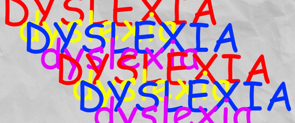
Tino, though, found it useful, not funny. “By [my sophomore year], I’d been diagnosed with dyslexia, so normally, the writing assignment would have been a pain,” he explains. “But I realized with Comic Sans, I was having an easier time reading and writing.”
At first, Tino thought it was simple a matter of being more comfortable doing his work at home than at school, but the more he worked with Comic Sans at school as well, the better he seemed to process the letters.
Contrary to popular belief, Comic Sans wasn’t designed with the intention of being easier for kids or people with dyslexia to read. According to the BBC, Connare simply felt something less “harsh and schoolmasterly” than Times New Roman would be more welcoming for kids, and modeled the typeface after speech bubbles in comic books. Further, the oft-viral fact that Comic Sans is “the best font for people with dyslexia” is unfounded as well. Yes, people with dyslexia might find it easier to read than what’s otherwise available, but there’s no scientific evidence to suggest that it’s any better than other fonts in the sans-serif family.
None of that should discount Tino’s experience. In fact, he finds Comic Sans easier to read than the fonts designed specifically for dyslexia. “It’s hard to explain the difference between my normal and your normal, but the best way I can describe it is that I have a hard time associating the combination of letters as words,” he says. “For example, sometimes I’ll write the same word with two different spellings without noticing, or after reading, I’ll recall the word automobile instead of car. This all makes reading longer paragraphs quite exhausting.”
But letters in Comic Sans have “almost invisible dents and indentations that give each one a unique form, which makes it easier to distinguish letters like P, B, D and Q,” he continues.
Jessica, a 30-year-old in Texas, has found that Comic Sans alleviates her struggles with dyslexia as well — but for different reasons. “The way dyslexia affects me is that I mix up phonics, so when I’m reading, my brain fills in the word that isn’t there,” she tells me. “But Comic Sans letters have a sort of definitive shape that have helped me ever since grade school.”
Not that she was ever all that forthcoming about it (the sentiment around Comic Sans is improving, but the ridicule around it is still strong enough that the font is hard to support publicly). “I would type up all my papers in Comic Sans, but then change them to be MLA-approved before handing them in,” Jessica says. “The font got me through nursing school, though, and that’s all I care about.”
As for Tino, he hopes people continue hating on Comic Sans. “Without the hate, I probably wouldn’t have even noticed Comic Sans and its uniqueness, so yeah, keep hating this fucker even though it doesn’t deserve it,” he tells me.
After all, he adds, “There’s no such thing as bad publicity.”

