
These days, no matter what your résumé looks like, it feels like you’re screwed.
It’s common advice to write an outside-the-box CV to stand out among the thousands of applicants vying for a job. There’s the guy who designed his résumé as a GQ cover for a marketing position, while Gen Z-ers entering the workforce put avatars and watermarks — and even photos of them literally sweating to demonstrate their hustle — on their social-media-inspired résumés. Even if you don’t get hired, the theory goes, at least you’ll appear to be a bold, savvy risk-taker.
But résumé peacocking is yet another myth of hustle culture. If you don’t resemble the company’s idea of an ideal candidate, experts say, you don’t have a chance of making it through. In that sense, it’s often better to fit in — on the page and in person. “What sells a recruiter on your résumé is that it looks easy for them to read it, period,” Donna Svei, a veteran headhunter and current executive résumé writer, tells MEL.
That easy reading starts with the typeface. Yes, your font can actually make or break a résumé. Svei, who’s reviewed an estimated 100,000 résumés in her 25-year career, explains, “[Headhunters] get very exhausted very quickly. Give them a familiar font that their eye doesn’t struggle with and let them focus on the content, not the font.”
Okay, like what? “Calibri checks that box,” she says.
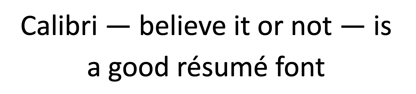
That sound you hear is 1,000 design nerds screaming into their Eames chairs. Calibri, the default font of Microsoft Word, is loathed in the type world. It’s juvenile, unoriginal and overused. Aesthetically, it looks like a typewriter fucked Comic Sans. It’s been called “elementary and unprofessional” and “one of the ugliest fonts ever invented by mankind.”
i dont understand why times new roman size 12 is not the default, who the fuck writes in calibri size 11
— alyssa coolen (@coolenalyssa) September 16, 2019
What is it about the Calibri font that makes me cringe so hard? ?
— GeekyAcrylics (@sedoster) September 17, 2019
comic sans – ridiculous child
times new noman – dull nonsense
arial – weak minded
calibri – calm arrogance— Jackus Mitchimus ?? #FBPE (@jackfmitch) September 14, 2019
But damn if Calibri isn’t readable — especially to the software many companies use to sort through their deluge of applications. These applicant-tracking systems scan for keywords to filter out underqualified submissions.
To headhunters, these systems are simple, dependable and efficient. To applicants, they’re flawed, unreliable and unforgiving. Applicant-tracking systems are the reason you get rejected 30 seconds after submitting, before the company even knows your name. In 2016, Lever reported that 1 in every 152 candidates who applied through their applicant tracking systems was hired.
“Anytime you’re uploading a résumé electronically, your assumptions should be that it’s going to be run through some kind of criteria or algorithm,” Svei says. The point is, stop “throwing your résumé in the black hole” with creative fonts and over-the-top designs.

Some applicant-tracking systems are so old they can’t process new fonts, bullet points or even the standard. Amanda Augustine, career-advice expert at TopResume, told tech news site CIO that serif fonts — while arguably more sophisticated and professional-looking — can mess up the ocular character recognition software used in tracking systems. “Avoid using arrows or other intricate symbols for your bullet points, as many applicant tracking systems will translate those into a garbled mess,” Augustine says.
Some headhunters are doing away with traditional job-board websites entirely. “Gone are the days when people are just going to look at paper,” says L.T. Ladino Bryson, director of new recruiter website vCandidates.
“As a recruiter, I used Indeed for my sourcing. They take out all the guts,” Bryson tells MEL. Once, she says, a candidate for a design position submitted a résumé in the form of a movie poster. On her end, all she received was text on white paper.
To avoid these pitfalls, she suggests hosting a portfolio website, having references already written and ready to go, and even creating video self-pitches. What’s more, she says, always find a direct contact at the company.
Of course, you don’t want to go too far with the generic-looking résumé. You still need to tailor it specifically to your industry. “If you are applying for a designer role, I want to see something creative there. If you’re applying for a finance role, I want to see numbers,” Julie Kim, a senior recruiter at advertising agency Jun Group, told Time in January.
The TL;DR: Don’t depend on creativity when substance matters more. If you need a scam to cover for a lack of experience, optimize your word choice when showcasing your skills. Don’t expect a selfie-laden résumé to save the day. You can cry about that lack of creativity over a round of drinks — with your new coworkers.

Joseph Longo
Joseph Longo is a culture and entertainment journalist whose work has appeared in The Associated Press, Entertainment Weekly and more. He's still trying to understand what it means to be a Gemini Rising.