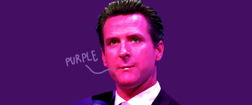
Coronavirus infections are spiking across the U.S. again, and it’s going to get worse when families stubbornly travel and gather in large numbers for the holidays. While some anti-science politicians have courageously protested further lockdown measures, Democratic leaders have moved to limit — or look like they’re limiting — the spread of the disease. Here in California, Governor Gavin Newsom has pulled an “emergency brake” and declared 41 counties… purple.
Due to the alarming increases we are seeing in #COVID19 cases, CA is pulling an emergency brake.
To slow the spread, 41 counties —94% of California’s population —
will now be in purple, the most restrictive tier.— Gavin Newsom (@GavinNewsom) November 16, 2020
Anyone else feel like this is a recurring nightmare? Specifically: the color coding for an ambient danger that you don’t have much control over. I’m quite unsure what it means, really, to be in the “purple” tier, though a little research shows me that Los Angeles County, where I live, has been designated purple for a long while now — and locals are still getting trashed at brunch in crowded parking lots around my neighborhood, so I fail to understand what’s “restrictive” here.
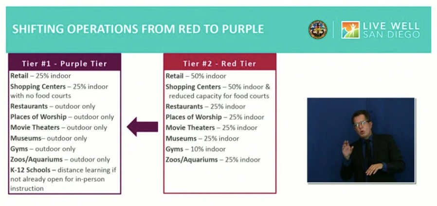
Oh, okay. So purple means… outdoor museums and aquariums are still open for business. Do either of those exist? Whatever, I don’t care. But while we’re here, why is purple worse than red? Why are there colors at all! I lived through George W. Bush’s War on Terror, I shouldn’t have to do this again. For almost a full decade, the Homeland Security Advisory System mostly bounced between yellow (for “elevated” risk of terrorist attacks) and orange (for “high,” which is somehow fucking different than “elevated”), only once reaching red (“severe”), and none of it did the average American a lick of good. Were we supposed to treat every stranger as an undercover Al-Qaeda operative when they pushed it up a shade? Clown shit, top to bottom.
Oklahoma State Board of Education spreading its COVID proposal tiers across multiple levels on one color, like a prestige TV series doing two totally separate seasons but calling them 6a and 6b https://t.co/QcbehxwbQs
— Chris Polansky (@ChrisKPolansky) July 23, 2020
Massachusetts last week rolled out changes to its color-coded coronavirus risk data, a move that shifted many communities out of the state's highest-risk "red zone." https://t.co/KtzeVtOBJj
— NBC10 Boston (@NBC10Boston) November 9, 2020
State leaders are moving to a new strategy in fighting the coronavirus. Instead of designating the risk of the virus under a color-coded system, the state will employ a new index that ties restrictions to local case numbers and testing rates. See details: https://t.co/J6rtu4nevy pic.twitter.com/PLGPXTzsqk
— Taylorsville City (@TvilleUT) October 14, 2020
Let’s just end this chromatic scaling altogether; it confuses and scares the population without ever informing them. You think your chaotic management of a pandemic needs to be communicated with visual flair, but the effect is very “kindergarten in hell.” It sure doesn’t improve matters that no two states will coordinate on their charts, either. Utah’s is literally three shades of blue, which, in itself, is making me ill. Damn, did your city get upgraded to deep azure? Finally time to wear a mask, I guess! No wonder we can’t get this plague under control.
CDC issues Halloween 2020 guidelines, color-coded coronavirus risk map | https://t.co/lHXz6idEan pic.twitter.com/CKyRDt0G10
— KOIN News (@KOINNews) September 19, 2020
Yeah, honestly, thanks for the cool map. It’s not as if each individual town in this country following its own, separate, ad hoc approach to the virus is a factor in its ongoing devastation. Keep the colors coming, you beautiful bureaucrats — I think with the right scary hue, we can maybe get the skeptics to take this seriously. Can’t wait for threat level chartreuse.

Miles Klee
Miles Klee is MEL’s resident tank-top dirtbag, shitposter and meme expert. He’s also the author of the novel ‘Ivyland’ and a story collection, ‘True False.’