Donald Trump’s angry, nearly all-caps Twitter threat to Iranian president Hassan Rouhani on Sunday night prompted relentless memes and jokes. Immediately, folks on Twitter applied the president’s screaming-tough-guy rhetoric to things like misbehaving cats and video games.
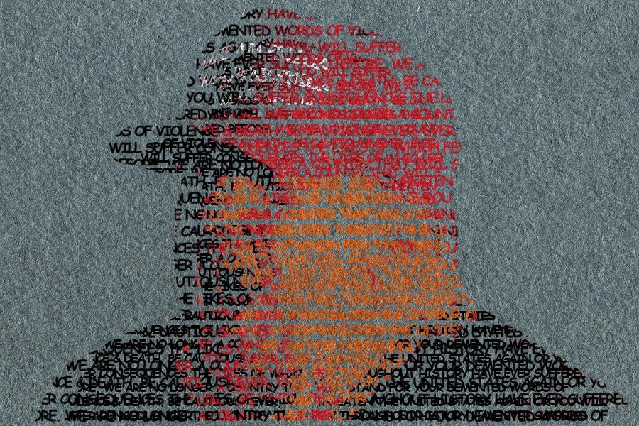
To Iranian President Rouhani: NEVER, EVER THREATEN THE UNITED STATES AGAIN OR YOU WILL SUFFER CONSEQUENCES THE LIKES OF WHICH FEW THROUGHOUT HISTORY HAVE EVER SUFFERED BEFORE. WE ARE NO LONGER A COUNTRY THAT WILL STAND FOR YOUR DEMENTED WORDS OF VIOLENCE & DEATH. BE CAUTIOUS!
— Donald J. Trump (@realDonaldTrump) July 23, 2018
It also made us wonder: How did all-caps typing come to be interpreted as yelling, anyway? And how do specific text-based choices signal meaning beyond the words?
When you look at a piece of writing, your brain uses lots of different signals to interpret its meaning. Sure, there’s the actual content of the text itself: what the words mean, the order they’re in, that kind of thing. But then there’s the physical appearance of the text — down to the shape of each letter — and the context it’s in. Think about the different feelings evoked by the typesetting in a book, or how each typeface feels as you cycle through options in an Instagram story.
All-caps internet shouting is a type style that’s fairly easy to understand, and it’s been more prevalent in recent years thanks to Twitter, a medium that rewards short and bold statements with attention. As Alice Robb notes in The New Republic, shouting in text has been around pretty much as long as the internet itself — culminating in a petition to ban the caps-lock key — and then in printed form long before that.
But writers and printers have been screwing around with different ways to visually denote anger, elegance and class—or to enhance or change the way that text should be interpreted — since the invention of the printing press. (Scribes were doing it before that, of course, but we have to start somewhere, so let’s start with Gutenberg.)
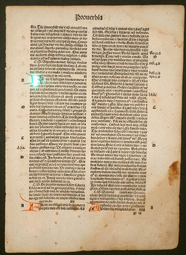
Italics
Italics were one of the earlier, and dare we say, “viral” precursors to all-caps writing.
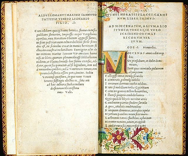
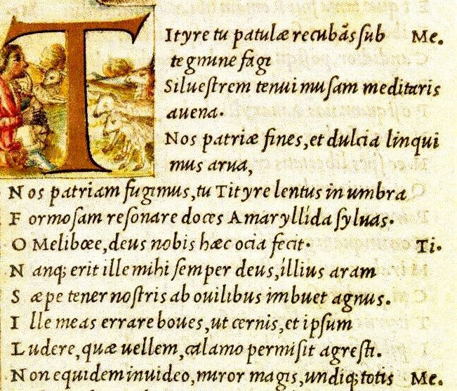
Italics were invented by Aldus Manutius, a Venetian scholar who lived in the late 15th and early 16th centuries. Handwriting at that time and in that place was mostly cursive, but printing was all in block letters. Manutius was a humanist, dedicated to scholarly learning in the humanities, specifically Greek and Latin classics, and humanism was a popular movement at the time. “Manutius was seeking to capitalize, pun intended, on the humanist market for classical texts,” says Erika Boeckeler, a professor at Northeastern University who’s written a book on early experimentation with the alphabet.
Manutius created italics not to emphasize, but to make text easier to read — similar to familiar cursive handwriting—and also to save space. He began printing classics — Virgil, Ovid — in italics, but also in the octavo form, which was a smaller size of book. It was basically a shrewd marketing move. He printed cheaper, pocket-sized classics in a way that would allow more people to carry them around, and also to make them sort of informal and nonthreatening. Beach reading, basically.
The italic font was immediately counterfeited and spread throughout Europe, and the meaning of the font began to evolve. In The Golden Thread: A History of Writing, Ewan Clayton describes how italics came to replace other methods of emphasis as the use of color decreased in printed text:
…headings or key words were highlighted by being written in capital letters. … After 1100 the places where we might use bold in a text today (for headings, key words and endings) were often written with the same pen and letterform as the main text but with a differently colored ink, often red, blue or gold.
Italics were associated with the classics, which gave them a lofty feeling even though they were originally chosen to be more readable for the masses. And the style itself, with its tilt and narrowness, feels a little elegant and maybe more emotional than a standard font.
From there, the use of italics changed. Today it’s used in a mess of different ways: for titles of books, for a character’s thoughts, for foreign or new words—or for emphasis.
Gothic
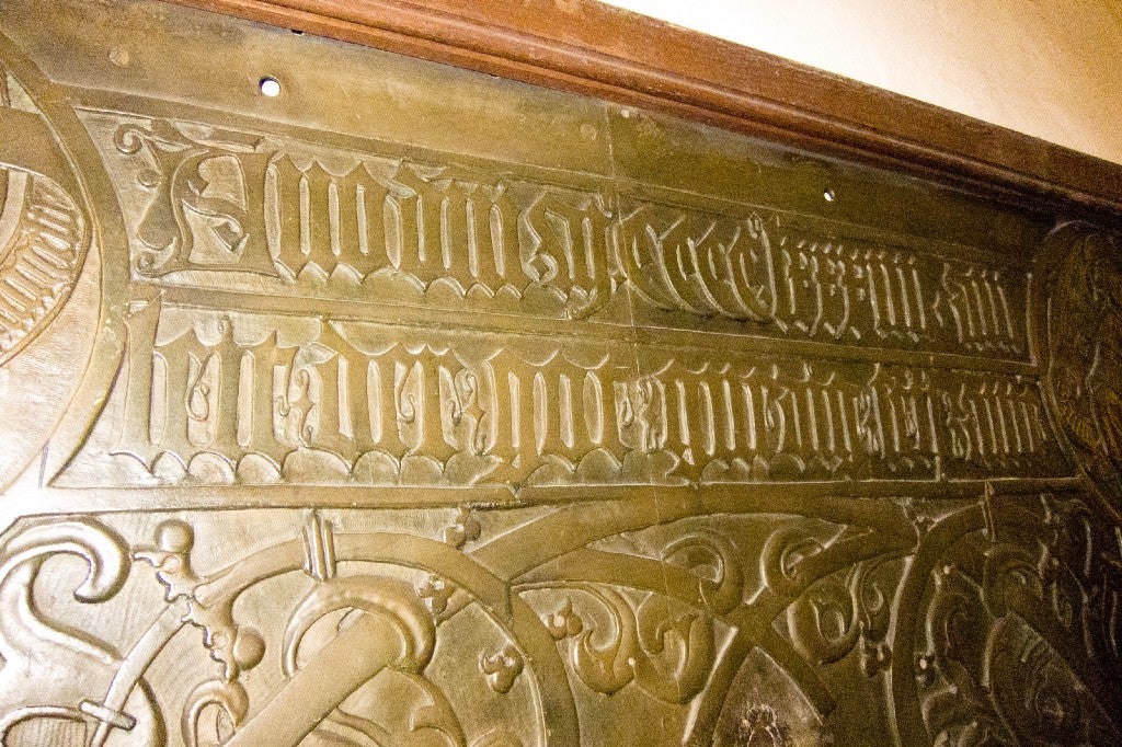
For a louder, stronger alternative to italics, there was blackletter. The humanists — Manutius’ crew — referred to it as Gothic, despite the fact that it had no connection whatsoever to the Germanic Goth people. These are heavy, ornate fonts, with both very thick and very thin lines in each letter. They were developed well before the print era, sometime around the 12th century, and were in some ways the opposite of Manutius’ italic fonts. Blackletter is hard to read; it’s bold and dense. The Humanists hated it and called it Gothic because they felt it was barbaric.
Sometimes, the weights and styles of blackletter changed in midsentence to add emphasis:
Clayton writes in The Golden Thread how gothic text was used for stress:
In legal documents right down to the 19th century, keywords were still written in larger bolder writing — sometimes in a formal fraktur [gothic] letter—and it is this practice … that is the nearest contemporary parallel to the introduction of bold letters within text blocks in the 1840s.
Blackletter is still commonly used, but today it denotes a few different specific things. There’s a weight to it, and it’s a pretty old font style, so you’ll see it used where the printer or designer wants some heft: certificates and diplomas, say, or in the designs of the headings of publications like the New York Times and Sydney Morning Herald. The heaviness and darkness of the font style also lends itself to artists who want to appear dark themselves: metal bands and rappers like Snoop Dogg, for example.
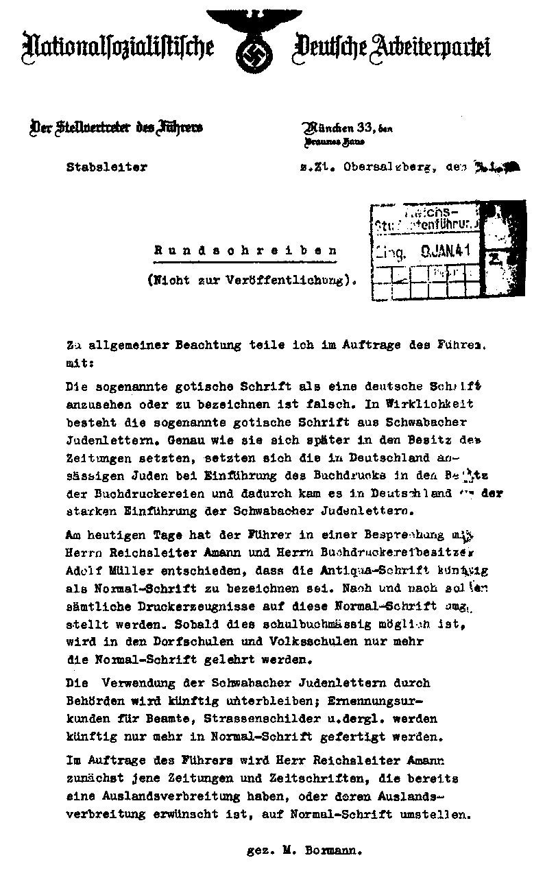
Gothic also became the go-to font style for terrifying-looking Nazi printing and other early-20th-century German text. “The Nazis took up that font as sort of the ‘true’ German font, and books were printed in that font in Germany up until the end of the Nazi era,” says Boeckeler. But Hitler disliked fraktur, and in 1941, the Nazis decreed blackletter fonts tainted by Jews and advocated for Antiqua instead.
Pattern Poetry
There are plenty of other ways that early printers could affect the meaning or interpretation of text outside the text itself. Pattern poetry, sometimes called concrete poetry, constructed poems in specific shapes; it was fairly common in the 16th and 17th centuries, Boeckeler says. A wedding gift might be a poem in the shape of a heart, for example, or a religious poem might be in the shape of an altar.
Random Capitalization
In the 18th century, capitalization in England was sort of wacky. “They had a practice of sort of seemingly randomly capitalizing letters, but I think it wasn’t totally random,” said Boeckeler. “Like, that could be a signal to the reader: ‘Pay attention to this word!’” Indeed, the early English grammarian John Hart recommended capitalizing every “important common noun.”
Capitalization of nouns that shouldn’t really be capitalized became popular, and though it fell out of favor after a couple hundred years, it hasn’t died off. Even today the question of what should be capitalized varies based on location, and I suppose, gut feeling. (See also: Trump’s tweets, a copy editor’s nightmare.)
Our Country is doing GREAT. Best financial numbers on the Planet. Great to have USA WINNING AGAIN!
— Donald J. Trump (@realDonaldTrump) July 24, 2018
The advent of ever faster and more efficient print, then the revolution of digital typing and dissemination, created huge changes that previously had taken centuries. All-caps typing, the use of asterisks and tildes before and after words or phrases, emojis — these all came rapidly to prolong Manutius’ text disruption well into the internet age.
It probably says something about modern dialogue that there weren’t really styles of writing to indicate rage or volume until fairly recently. But SOMETIMES YOU JUST HAVE TO YELL.