Fuck that Oasis album cover.
The band’s third LP, 1997’s Be Here Now, was a maelstrom of 1990s musical excess: overdubs, overproduction and the art to match. Its now-iconic image, shot by legendary rock photographer Michael Spencer Jones at former Playboy executive Victor Lownes’ mansion — the “pedigreed” site of a notorious Bunny “training camp” — featured the biggest band in the world standing around a real Rolls-Royce Silver Shadow they drowned in a swimming pool. For no reason, there’s even more bullshit in the frame, like a gramophone, a gigantic clock and an old wooden calendar that looks like Churchill shat it out. The whole album, from its production to its press tour, is gussied-up pre-Napster cash-to-toilet maximalism at its most ostentatious. (Noel Gallagher called Be Here Now’s sound “colossal”; he’d later call the songs “fucking shit.”)
Rock and roll, along with its branding, were due for a reckoning. Then some introspective softboys with loud amps and stolen copies of Photoshop started actually getting some attention. A song called “The Middle” put emo on the map, illegal downloads started cutting into massive corporate profits and 1990s excess gave way to a stripped-down, DIY-influenced design style. Emo minimalism captured a scene that wore its heart on its record sleeve.
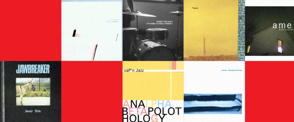
You know emo minimalism when you see it. There’s usually one photo; some simple, humble text; and a monochromatic background, often black or white. Its aim is not to overwhelm you with a visual treasure hunt. The best of this art makes you think about what’s not there.
Some examples look like they’ve actually been “designed,” like Thursday’s Full Collapse (below). One designer I spoke with called the 2001 post-hardcore release the “king of emo minimalism.” Some might say it’s not minimalist enough.

Other entries from this era look almost literally stapled together, with blurry pictures, squished type and basic Photoshop filters, representing accessibility and the emo-hardcore scene’s do-it-yourself ethos.
“If it weren’t for these albums, I’m not sure I would have gone down the design rabbit hole the same way,” says James Ellis, partner at NYC creative agency Public Announcement. Ellis moved to New York as a teenager and played in bands starting in the late 1990s, and he discovered his love of design in the punk scene. In the mid-2000s, he co-designed a pop-punk/emo classic album, Cartel’s Cartel.
“I was obsessed with the sound of records and producers; I wanted to be part of that world,” he tells me. “So the fact that the design and packaging were actually accessible — we could go on AOL chatrooms and download .rar rips of Photoshop 3.5 — [led me to] become a design kid. You didn’t have to have a record label pay a designer to make your thing. That’s what the aesthetics of emo, punk and DIY were born out of.”
Besides, the rules were easy. “One image. Tiny bit of type. Graphic designers put it into my brain: The best design is less,” Ellis says.

In the late 1990s, young people who couldn’t yet produce their own music on their laptops could still try to create something. “The way these records look is because regular people made them,” Ellis says. “Aesthetically, I think the [emo minimalism trend] is tied to technology, similar to how the look and quality of video have always dated the moving image. We went from paste-up punk to desktop publishing to a mainstream ability for young people to design their own record packages with warez downloads of Adobe programs. So for me, the aesthetics are the product of professional tools in the hands of amateurs who already wanted to DIY. By the mid-2000s, everyone knew someone with Photoshop, someone who kind of knew how to do this.”
On top of all that, you had the reaction to the design excess of the 1990s. These designers, Ellis says, “were trying to one-up each other, putting graphics all over the place. It didn’t feel real unless it had something complicated happening. Stuff was crusty, or manipulated to feel crusty. Extreme type everywhere. It was fueled by legit budgets. But then people realized, actually, what a record cover comes down to is a little bit of type and an image in a square. It’s a strange puzzle. That’s what you have to work with.”
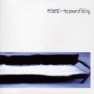
Mineral’s The Power of Failing, seen above, is a great early example of this accessibility. There’s a photo of a blurry bench covered in snow, a white background and some very non-designer-friendly squished type. The photo exists to make you wonder who once kissed on that bench before winter cleared out the college path it’s on. (By contrast, Be Here Now informs you that Oasis is rich and fuckin’ loves vintage clocks.)
“The reason this style hits with people,” Ellis says, is the feeling of “I know you,” like these bands — and their designers — could go to your school. If you grew up on Long Island or went to the University of Illinois Urbana-Champaign, those guys might’ve really been your classmates. The art they created, sonically and visually, represented a path forward for kids who had little to aspire to and can’t see themselves in anyone else around them — young creatives like Ellis. “It’s regular people who are fucking doing it, and it’s so sick when everything in the world feels so beyond you,” he says of that era.
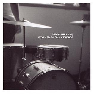
I know that feeling all too well. For me, it came from Pedro the Lion’s 1998 album It’s Hard to Find a Friend, which jolted me into teenage art-kid consciousness when I got it as a 14th-birthday gift in 2002. At that point, I listened to nothing but double-time pop-punk and skate punk (NOFX, AFI, No Use for a Name) and was polishing a drumming style I can only describe as beating a metronome with a ball-peen hammer. But Pedro was a slowcore multi-instrumentalist and singer, David Bazan, who wrote and performed guitar and drums on spare, carefully edited arrangements. He sang about infidelity, disappointed fathers and falling out of love with god. I was hooked.
The album art, too, was monumental for young emo kids like me. There’s a palpable sadness in this bleak, grainy, black-and-white image. Combined with a clean sans-serif, it evokes a specific moment in time: the chaos of teenage loneliness, righted by the order of neat white text.
“Look at everything that’s not there,” Ellis says of that cover. “There’s no rack tom, no cymbal stand. You want viewers to stare at this thing and imagine something.” I imagined myself doing exactly what Bazan did: building an album myself and playing music forever, or at least writing deeply personal shit for an audience of other lonely kids. It wasn’t just the music that felt approachable — it was the scene, the production, the whole process of creation. I’d spend hours on my dad’s copy of Adobe Illustrator putting clean white Helvetica text on blurry band pics. We printed out the art on a 1990s desktop printer, cut it out by hand and stuffed it in garage-recorded CDs to sell at Veterans of Foreign Wars punk shows. What could’ve been more satisfying? Drugs?
For me, the second-most influential album cover is American Football’s LP1. You may know the house. This image wrecked me.

This photo of 704 W. High Street in Urbana, Illinois, is a classic cover — still bringing in waves of emo tourists to take selfies nearby — and for good reason. “It’s actually communicating an incredible amount,” says Ellis, excitedly. He focuses on the light coming out of the windows, pink and extraterrestrial. “Maybe that’s the fuckin’ jam room! They’re shredding in there, neighbors hate them, it’s awesome.”
Nearly 20 years ago, I couldn’t stop staring at that window either. For two decades, to countless fans, this album — featuring “Never Meant,” Vulture‘s No. 1 emo song of all time — has been an entryway to the genre of Midwestern emo. This gentler, twinklier, more math rock–y style has very little hardcore influence; it’s known for groups like Cap’n Jazz and Braid (Illinois), and the Promise Ring (Wisconsin), many of which emerged from shitty campus houses just like 704 W. High Street and bottled the DNA of countless acts in the 2010s emo revival. American Football’s LP1 literally welcomes you in; the magic is right there, in a no-name house in a nowhere town, waiting to be discovered.
It was a mesmerizing image for me, drinking raw farm-squeezed milk and learning abstinence-only sex-ed in cornfield-rich southern Ohio, in a village near Dayton, four hours from Chicago. Here, the only diversion was racing our parents’ minivans down Polecat Road and occasionally playing some DIY shows at a Knights of Columbus hall or my friend Kyle’s living room, where we could, for a few hours, make that light in the window ourselves.
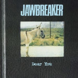
Look, too, at the album art’s cropped font, which reads like americ anfootball. “The whole idea of fonts was new. No one knew what a font was! Regular humans had no business knowing the name of any font before desktop publishing hit,” Ellis points out. Never underestimate the value of what Ellis calls “rad type.” We both love the cover of Jawbreaker’s Dear You, a classic example of mid-1990s minimalism: a notebook, a photo. Crack me open and discover this, it seems to say. “Jawbreaker always felt like the cool older boy,” Ellis says. “The perfect band name, set in rad type; this three-piece rock thing; the donkey.”
Post-Jawbreaker, the most influential designer in emo minimalism is certainly Jason Gnewikow, who designed virtually every classic on Jade Tree Records, including Analphabetapolothology, the 1998 album by Cap’n Jazz, whose then-teenage members would go on to spawn bands like the Promise Ring, American Football, Owen, Joan of Arc, Owls and many others.
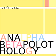
Gnewikow “mixed retro and modern, tying great typography and art design magazine layouts together in a way that doesn’t look dated, like so many of that era’s art design magazines now look,” wrote Corey Vilhauer on Medium in 2016. He “defined a subset of emo aesthetic that was able to weather the storm to come. When emo became over-commercialized and insincere, we still had Gnewikow.” He “defined the aesthetic,” says Ellis, who cofounded the creative studio Athletics with Gnewikow. “He brought advanced graphic design into this world.”

Ellis’ favorite example of emo minimalism is a throwback: Fugazi’s In on the Kill Taker, the emo-hardcore godfathers’ 1993 masterpiece. He sums up the art: “Washington Monument, typewriter type, a hint of some lyrics. Things like In on the Kill Taker looked like I could do it,” he says.
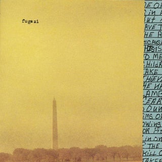
Musically, too, the album was formative. “In on the Kill Taker sounds like humans in a room,” Ellis raves. “Everyone’s brain can hear when music is locked to a grid. Everything is tied to a click track, and your brain figures out they’re playing 120 beats per minute and the 1 [beat] is falling where you thought it was gonna.” But Fugazi sounded like “wild creatures. The human brain can tell they’re doing this together, live, off-click. It’s a different thing. It sounds more accessible and human.”
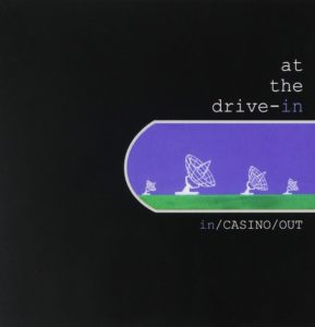
Another pick: At the Drive-In’s 1998 album In/Casino/Out. It has some satellite outlines and Courier type on black background. “It’s so dead simple,” Ellis says. “It looks like I could make it. That’s what minimalism is. There’s no excuse for not being able to pull it off.”
In/Casino/Out aside, what’s up with all the white? “My hottest take is this: Even in emo album design, everyone was trying to be the fucking Beatles,” says an NYC-based designer who asked to stay anonymous. “Everybody wanted the White Album,” she says — “especially Elliott Smith. But as we got older, we realized one very important thing about creativity: There’s more to life than the fucking Beatles.”
The designer selects Glassjaw’s Worship and Tribute, an album of post-hardcore anthems. Its album art is fully transparent except for a record player needle. It’s a mellower, maturer, more hopeful-sounding follow-up to a debut album known for singer Daryl Palumbo calling his ex a whore. “I always felt like Glassjaw were saying, ‘Please listen to the album, that’s all. That’s all we wanted to say.’ I find that fucking beautiful,” the designer says. The opening track, “Tip Your Bartender,” talks about soldiers and war — it was recorded around 9/11 — and includes the line “Not throwing stones at you anymore.”
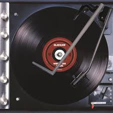
Maybe there was a deeper existential dread at play, the designer adds, in this album design and in the industry more largely: “There’s this thing that happened after 9/11 that was almost like, ‘I don’t know what to say that isn’t devastation, frustration and sadness.’ So, like, a band picture doesn’t work!”
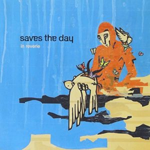
As the genre reached more mainstream success in the mid-aughts and bands like Brand New and Saves the Day signed to major labels, professionals took over the production. These 2000s-era records looked and sounded more polished, but they still tried to capture the same simple, bespoke DIY aesthetic. Even Full Collapse, Thursday’s iconic sample of emo minimalism, Ellis calls overdesigned, pointing out the “totally unnecessary grid pattern.”
The technological shift affected the genre’s sound, too. Better recording “took the anxiety out of it,” Ellis says. “My brain knows that everything is going to work out in this song, they’re going to hit every note, everything is going to be correct. It universally made people feel good. Professionals and computer nerds were clearly working on this.”
With all respect to Metallica, Master of Puppets is a classic, but how are your burnout friends going to make something like that? Emo and hardcore — and the creatives who gave it its signature branding — may have been reacting to 1990s maximalism, but emo would have occurred in any era because it’s simply an extension of how young people feel, Ellis says. “The best record covers ever are that simple. Pick your image, pick your type. Classic. Popular. Anyone can make a cool image and set type in a way that sticks with you, and [now] anyone can go record their record on GarageBand.”
Emo’s visual appeal was a product of rapidly shifting personal technology, but what strings together these era-defining albums is an accidental quality — at once graspable and aspirational for wannabes like us. In 2003, my band embraced its goth streak and set up a photo shoot for a new T-shirt design. At sundown, we took our instruments to a large old tree by the village’s swimming pool. We tied guitars to branches and let them fall like leaves, an overwrought metaphorical statement about how deeply our angst was tied to the smallness of our town and the emptiness of Ohio. We loaded the images on Photoshop, spent hours cropping out the background, blasted it to hell with filters — and finally no one could tell what the fuck it was. We gave up and used a black-and-white photo of us playing live. We were 15, it was the best we could do, and really no one gave a shit as long as we were making something.
“No one wanted to be in a band because of how it feels to have a sick record cover. No one gives a fuck!” Ellis laughs. “I want to be in a practice space, lit, loud as fuck, no financial reward, just doing this like fuckin’ weirdos. I like the way it feels to be on stage, fuckin’ cranked. That’s the whole thing.”

Cooper Fleishman
Cooper Fleishman is MEL’s director of news and audience, overseeing the Daily desk, social media, traffic growth and editorial product/engineering. He came from Mic, where he launched The Future Is Now, a channel about tech and digital culture, and Multiplayer, a gaming vertical focused on diversity and representation in geek culture. In a previous life, he was New York bureau chief at the Daily Dot, a copy editor for Us Weekly, a dog food salesman, a T-shirt silk-screener and an ’80s cover band drummer. He spent 21 years in Ohio, which explains a lot.