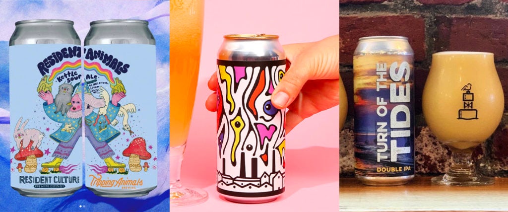
When it comes to selecting what kind of beer I’m going to drink, my methods are far from scientific. There are lots of things I like, with stouts, porters and sours being my favorite, but I also enjoy saisons and even the occasional IPA. So when decision-time arrives, unless the name is making a pop-culture reference I love — you have a stout named after the Stay Puft Marshmallow Man? I’m in! — I go with the can design that captures my eye the best.
In my defense, many craft beer can designs are awesome to look at — a form of high art in their own right. Seriously, take a gander down the beer aisle; it’s not quite an art gallery, but it’s not the bread aisle either. Who, though, are the Picassos, van Goghs and Kahlos behind these designs? And what comes first — the beer or the beautification?
To better understand how craft beer became the Sistine Chapel of the booze world, I reached out to a few of the best beer-can artists in the business. This is the picture they painted for me…
Ben Bishop, Artist for Mason’s Brewing Company
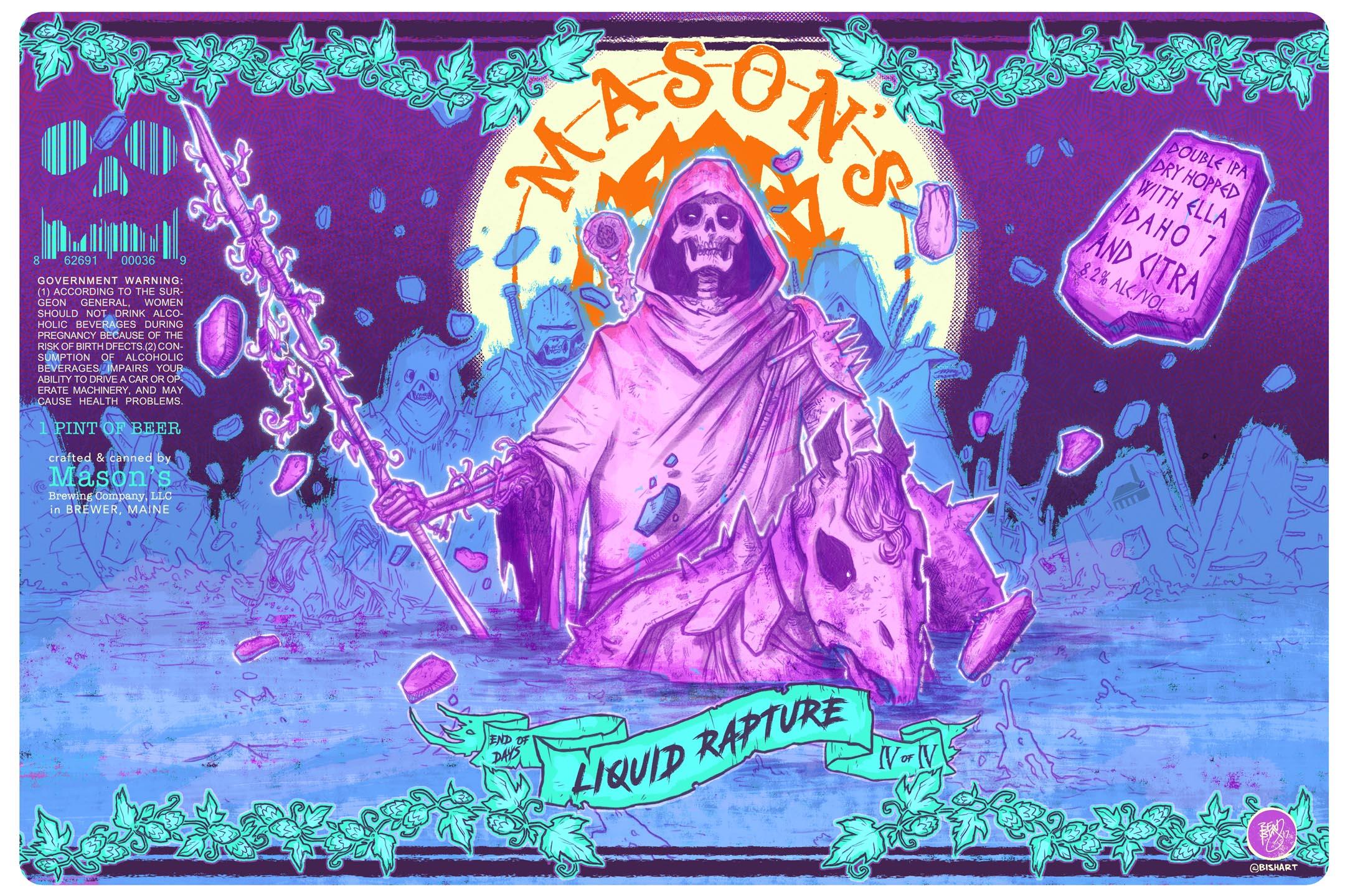
I’ve been a can artist and designer since 2016. I got the job because I was out drinking one night with a buddy, and he had a friend who was the owner of Mason’s — Chris Morley. He introduced the two of us, and we started drinking and talking about labels we like and labels we don’t. At the time, everything he was doing were the kind of labels I don’t like, so we had this friendly argument where I tried to sell him on the idea of having really graphic, illustrated, story-based characters as the artwork. He didn’t seem to go for it, but a few days later, he called me up and said, “Let’s try it.” We’ve been doing that ever since.
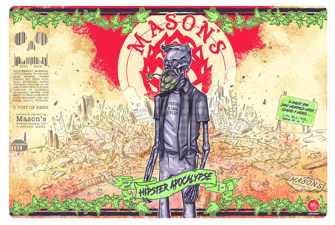
I try to bring my knowledge of various comics, 1980s toys and album art to the artwork. The cans are very much character-based — I could write an entire comic book about each one and give them all a backstory. The first one we did was for their flagship beer, Hipster Apocalypse, and the process behind developing the artwork is pretty much the same as it is today. Chris will have an idea for a beer, but he won’t have a title — or maybe all he has is a title and then we’ll talk it out from there. Once I’m at the point where I feel like I know what he’s going for, I’ll go off and do the rough. When I bring it back to him, he almost always says, “That’s it, go for it!” The only notes I ever get is to make sure it’s super colorful because he wants to make sure it pops on the shelves.
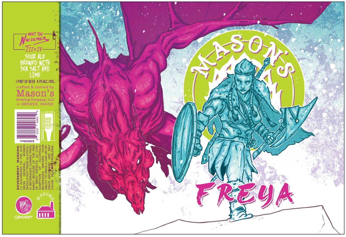
I have synesthesia, so I can “see” sounds. When someone says to me they want to do a sour, I think of lime green or maybe pink. With New England IPAs, that feels like a green or a blue to me. So, color-wise, I use my instincts and combine that with the title Chris and I discussed and build something from there.
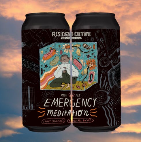
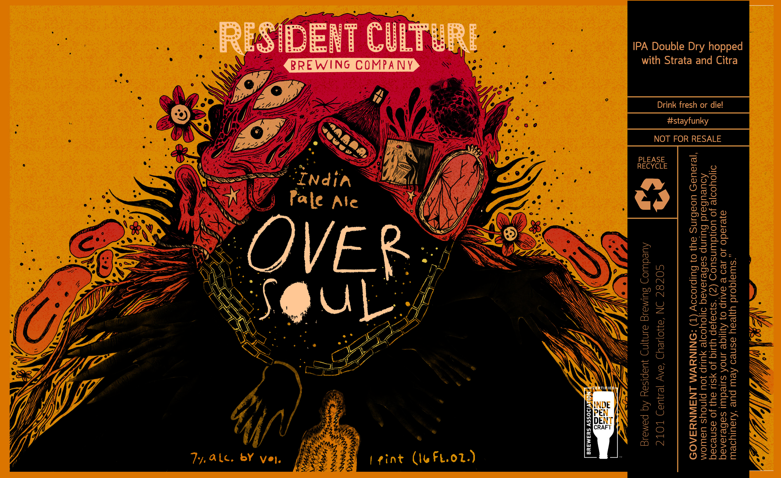
Maryssa Pickett, Artist for Resident Culture Brewing Co.
I’m not much of a beer drinker, funny enough. I’m happy with a Miller High Life, if anything, but I started working with Resident Culture when I was a senior in college. They reached out to me because they’d seen some stickers I’d done on someone’s laptop. It was perfect — I was a college student, and a job was exactly what I was looking for. Before long, I became full-time.
The way it works is that the brewing team has this whole production schedule, and they’ll relay to me the name of the beer and what they’re looking for. They brew a lot, so I typically have a couple of labels to do a week; last year though, all they were doing was cans, so I was doing five or six labels a week!
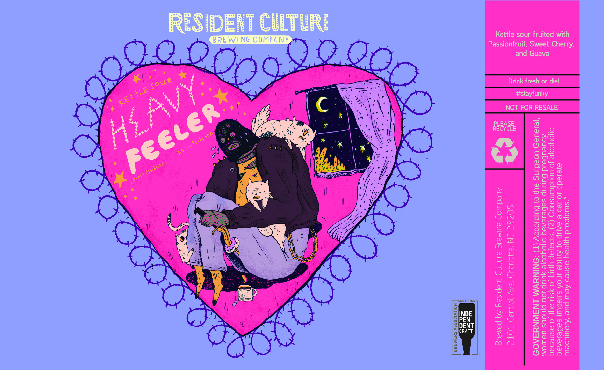
The more I’ve learned about craft beer, the more the style of beer has influenced the artwork. I’ve had fun creating different little worlds for each style. With IPAs, I’ve made them a little more vivid and psychedelic, but pilsners and lagers are softer and have more delicate linework. Sours are really different; they’re more about the color schemes. Again, each style has a different feel — or at least that’s what I’ve tried to do.
Matt Wiley, Artist and Brewer for Flying Machine Brewing Company

I started brewing when I was pretty young. I was like 15. Then, when I was 18, I moved to the U.K. and got a degree in fermentation development. I was still too young to brew in the States, so I moved to New Zealand and brewed there and then I helped out at a brewery in Cambodia. Next, I moved back to Vermont and worked for Magic Hat. After that, I was hired for Flying Machine as their research and development brewer, creating small batches of beer.

In the beginning, they didn’t want to bother the actual branding guy with making labels for these little batches, so I just made my own. I have zero art background, but the first label I did ended up being a big hit. It’s a funny story, we were visiting Jack’s Abby Brewery near Boston, and we told the brewer there that we wanted to focus on lagers. He says, “You can focus on lagers if that’s the mountain you want to die on.” We thought that sounded so cool, so we made this beer called Death on Lager Mountain. I based the artwork on the tarot card of the fool. From there, it became a series with Curse of Lager Mountain and Escape from Lager Mountain — we even have a lager festival now called Party on Lager Mountain.
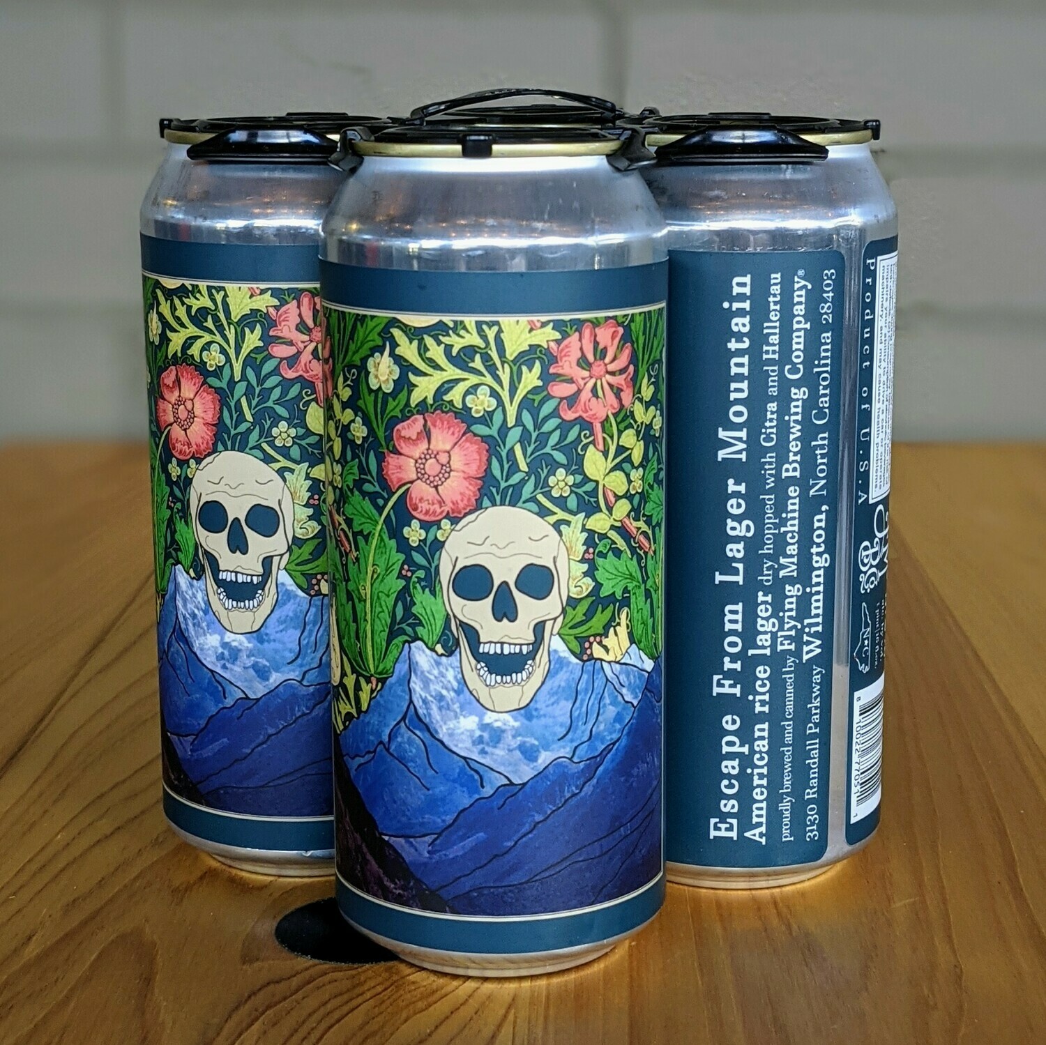
Nowadays, I do all the artwork and branding. While the head brewer comes up with most of the beers, I’ll usually come up with the name and that informs the artwork. I spend a lot of time thinking about what kinds of art is right for what kinds of beer. With lagers especially, the market doesn’t quite go nuts over them, so I find myself trying to up the “cool” factor. To do that, I generally throw a couple of skulls on there, and suddenly, people go nuts over it.
Mike Semenec, Artist and Co-owner of DSSOLVR
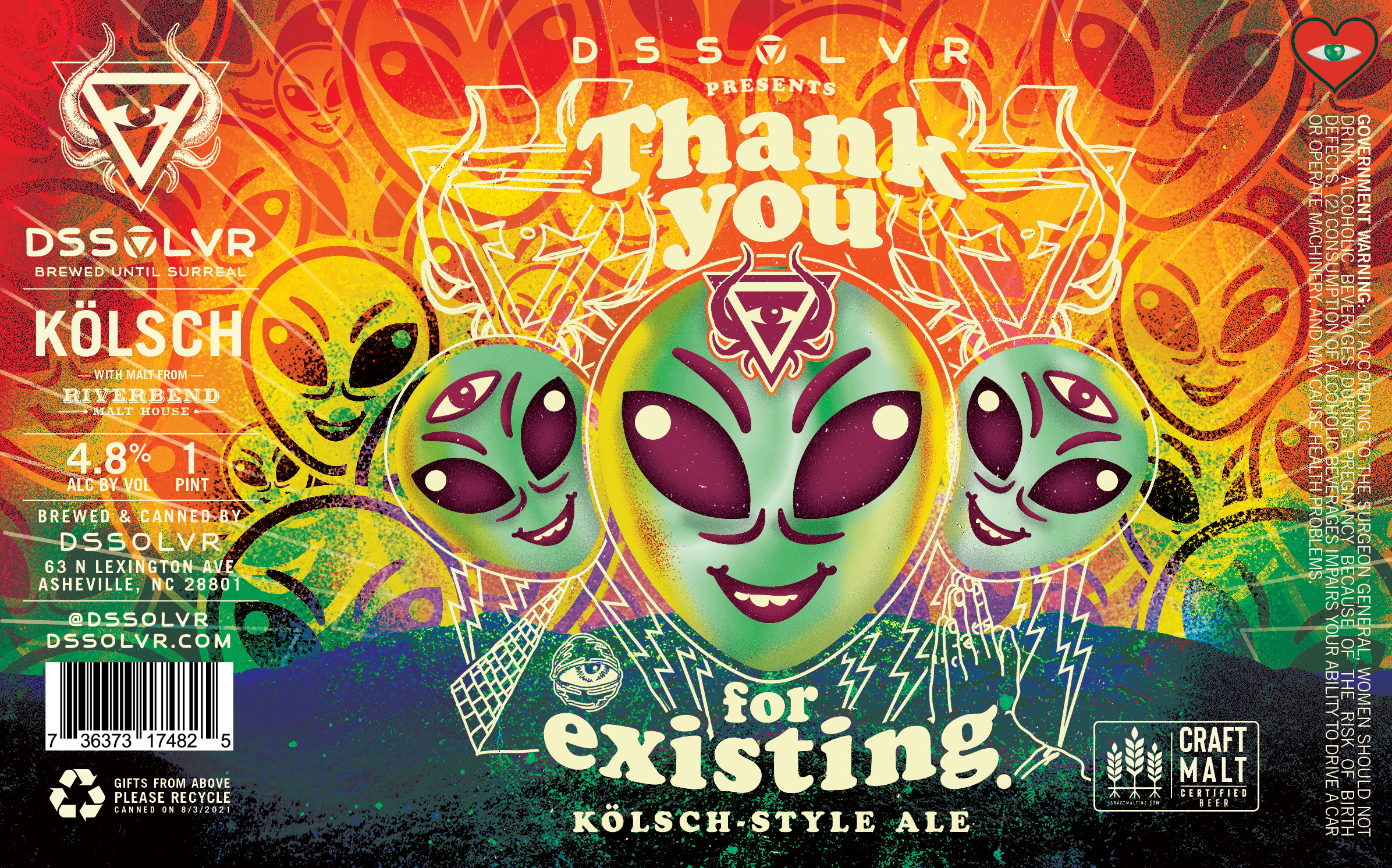
DSSOLVR opened in December of 2019, which was right in time for the pandemic. We struggled for a while there, but right now things are going very well for the brewery. The shutdown gave us an opportunity to focus on our distribution game versus running a taproom, and also allowed us to work on the art and making sure that the cans looked awesome.
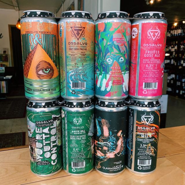
Creatively, things can go a couple of different ways, but generally, my business partner will have a concept for a beer and we’ll workshop it and discuss it. From there, I’m usually the one throwing a brand name on there and developing a look and feel for the label. I love surrealist artwork, so a lot of that influence has ended up on the cans. That, along with a lot of illuminati-looking stuff and aliens and skeletons and skulls — that’s how you end up with a DSSOLVR kind of label.
Schiani Ledo, Artist for Tactical Brewing Co.
When it comes to naming beers and creating the labels, at Tactical, we like to layer passion on top of passion. Like, the co-owner, Doug Meyer, is really into popular culture and he wanted to do a Jurassic Park can, so we came up with Must Go Faster which featured an image of Ian Malcolm without his shirt. We also did a Princess Bride one called Guavango Montoya. So the things that we’re really into, we’ll turn into a beer.

Different kinds of beers do call for different kinds of artwork. For stouts and IPAs, we tend to use more skull imagery that’s, for lack of a better term, heavy-metal-esque. Sours tend to get a lighter treatment. It’s mostly about the name of the beer though, and we try to make sure it has a sense of humor to it. There was one we did called Cuddly Chupacabra, which had this Gizmo-looking character with hearts and rainbows, but it’s sucking on a goat head. That was a really fun one.
Andrew Houle, Artist for Channel Marker Brewing and Blaze Brewing Co.

People always ask me, “Are you coming up with the name for the beer?” But the breweries come up with the beer and the title for it, and they give me some creative direction. They might send me some photos or reference shots, but then I go off and begin my process. I typically start with a rough sketch, giving them a couple of versions to choose from, and once they choose, I start painting. I generally need about a three-month lead time because I’m creating an original oil painting specific for their beer.
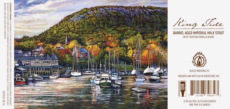
A painting has to have a certain style to match the beer and that’s not lost on me. For Channel Marker, we did this triple IPA called Captain’s Feast, and because of the name and the kind of beer it was, I knew it had to be something serious and powerful. I ended up going with this family photo of my wife’s grandfather fishing out of Gloucester. That was a rewarding one for me.

I have a bachelor’s degree in illustration from the Montserrat College of Art, but while I was there, the Fine Art Department was pulling me more in the direction of being a traditional painter. For a long time, I really struggled with that. I tried to figure out which one I was supposed to be doing while straddling both worlds — I was working for clients on things like beer can art while my paintings were showing in galleries all over the world. Eventually though, I came to realize that the two worlds can co-exist quite nicely.

Brian VanHooker
Brian VanHooker is a staff writer at MEL specializing in pop culture, food (especially pizza) and long form oral histories. He is the co-creator of the comic book "Barnum & Elwood" and "The Tramp," a comedy pilot starring John O'Hurley. He also hosts a TMNT interview podcast called "Turtle Tracks" and was once called a "Good Guy" by Mr. T.