It’s funny to think of armchair typographers being a thing, but the visceral reactions people have to Comic Sans suggest that indeed they are. Mention the font’s name, and all of a sudden you have people sounding off about kerning and baselines, talking about intended use and readability — people who’d never previously displayed any interest in design whatsoever.
It's time to stop laughing at Comic Sans, and start laughing with it. Here's why.Share this video if you agree!
Posted by MEL Magazine on Monday, March 6, 2017
These days we’re all feeling the pressure to display a level of expertise on every subject. The quickest way to do so is to join a crowd and set yourself poles that can guide your opinions. With typography, which has developed a kind of hipster cool over the past few years, you have something like a love of Helvetica at the top end of the pole — clean, useful, the subject of a beloved documentary that also happens to be on Netflix — and at the other end, you’ve got poor, reviled Comic Sans.
It is the Coldplay of fonts. It’s everywhere, but nobody will admit to liking it. Attempts have been made to ban it. Objections range from specific typographical problems embedded in the font’s make-up to woolly, vague, intangible sentences that don’t really hold a lot of water, as in this short documentary from director Anita Brown, when a student claims that “the Swedish would never accept that kind of print.”
But, like musicians who claim Coldplay “have a few decent tunes” (“The Scientist” is good, actually), graphic designers are drawing a line when it comes to Comic Sans hate. Gavin Day, a graphic designer and photographer at digital agency Things Unlimited, says that “when people slag it off, what exactly are they slagging off? Apple ripped off their own version [Chalkboard], so there must be something about it.” Imitation, after all, is the highest form of flattery.
Sean Jones, a freelance graphic designer based in Edinburgh, is also a fan of Comic Sans, if largely for nostalgic reasons: memories of schooldays and the first times he ever used a computer. These days, he says the font fits in with “the new ugly,” a design concept pioneered by Berlin magazine 032c: “They take the stuff people find ugly in graphic design and deliberately use it. They use Comic Sans-like fonts, and stretch and distort them — it’s very edgy.”
Overuse, or misuse, is the crux of many complaints, but if that is the case, what was the font’s intended use? Vincent Connare, the designer of Comic Sans, created the font for the Windows program Microsoft Bob in a bit of a rush — three days to be exact — after seeing the font they were going to use for cartoon speech bubbles was Times New Roman, which he felt was too austere.
Connare looked to old comic books as inspiration for something new,that would better fit the cartoon-like purpose. This is perhaps why it’s often used in primary schools and other child-friendly places — its genesis is rooted in media traditionally aimed at the young. And as it became so widely used with children, some anecdotal evidence sprung up to suggest that it was easier to read for people with dyslexia.
I don’t want to get all “death of the author” on you, but any creative output can take on a life of its own immediately after being put out into the world. Comic Sans may have been designed with cartoon speech in mind, but that doesn’t really signify once it’s out in the public domain, being used for everything from gravestones to business cards. It became a meme in the original sense of the word — a unit of cultural transmission.
But it’s not surprising that as Comic Sans has been shared, used and shorn of context for years, it has found a natural home in memes as we think of them today. In Doge, Comic Sans has found a scenario worthy of its design. Go on, imagine reading “So font. Wow. Much kerning” in Century Gothic — the latest font to feel the collective ire of the internet, according to Jezebel. It’d look awful.
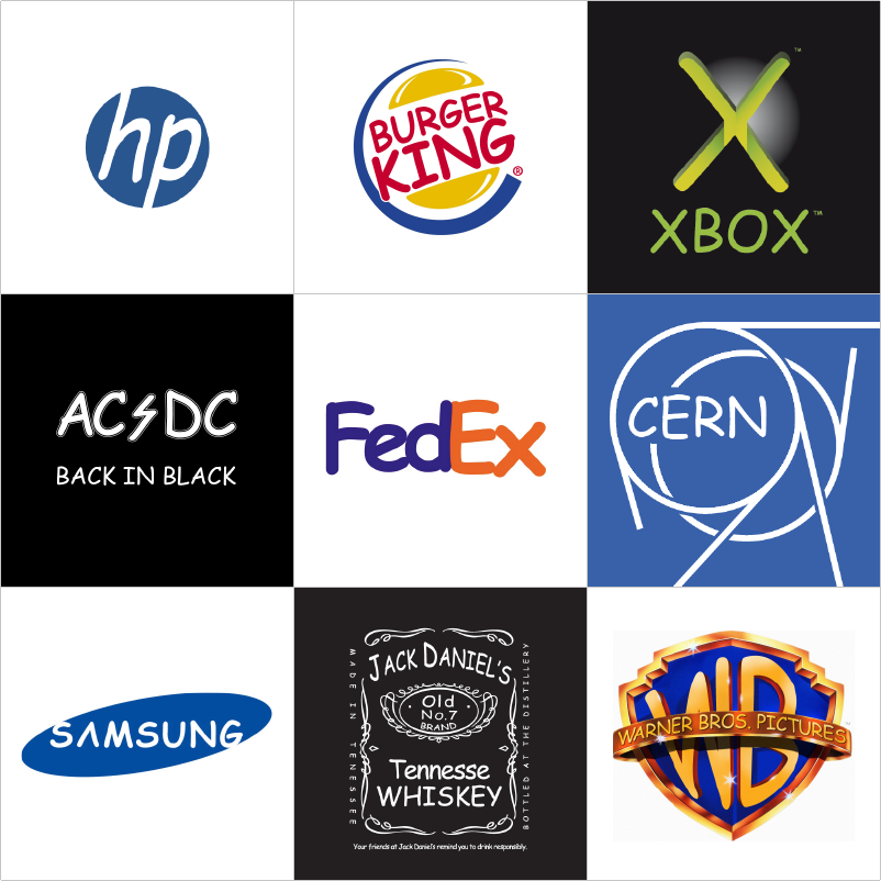
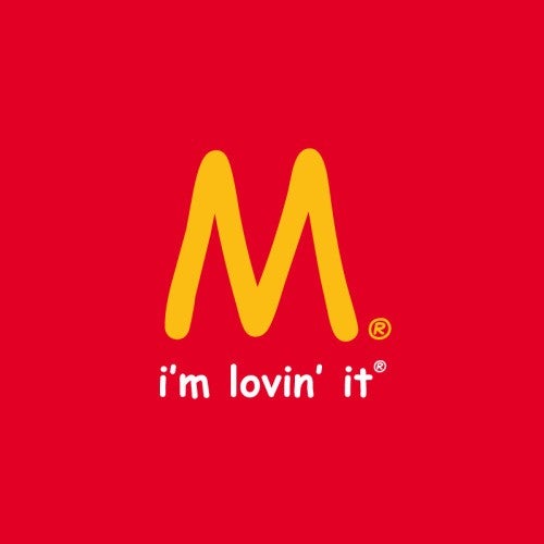
This postmodern approach to the font was also taken by the Parisian creative agency Les Jeunes Loupes, who set up The Comic Sans Project at the tail end of 2011 (in fact, they contrast the font with Helvetica in their mission statement). The project reappropriated the font on a number of well-known logos, and a lot of them work really well.
Going back to Anita Brown’s Comic Sans documentary briefly, the late associate professor of advertising Tom Fauls of Boston University describes good typography as like a “clear goblet that holds wine” — the idea being that the material’s main purpose is to properly showcase that which is within it. It’s a nice analogy, and it holds water (or, I guess, wine) here. Despite the ubiquity and recognizability of Comic Sans, it appears perfectly appropriate and, in a sense, invisible, in many of the examples — the M&Ms Logo, the H&M Logo, the Walt Disney logo; even this sliced-up Android logo is pretty neat.

There is a moment in an episode of VH1’s Storytellers with Bruce Springsteen, where after playing “Devils & Dust,” he picks the song apart line by line. He details every word, every metaphor, every political allusion in the song. It’s remarkable. At the end he says something to the effect of: “How much of that was I thinking when I wrote the song? None of it. How much was I feeling? All of it.”
That’s the order our emotional reactions work in — we feel first, think later — but the gap between the two is getting shorter. It’s no longer good enough to justify an opinion with “I just like it” or “I just hate it”; you have to show your work. Sometimes this is necessary; other times, it just ends up in a lot of people getting tangled up in knots.
Because we’re not all experts in everything, nor should we be expected to be. I wouldn’t go to a chef for an opinion on how to properly structure this article, and I wouldn’t go to my editor for a foolproof method for how to poach eggs — if such a thing even exists, which in this writer’s opinion, it does not. Don’t ask me why. I couldn’t tell you.