By the end of the 1990s, over a third of American households had computers with internet access and office workers were becoming increasingly used to killing time by surfing the web. And yet, the early 2000s were an especially volatile era for the world wide web. Right after the Y2K crisis passed — with ample anxiety but only minimal disruption — the dot-com bubble expanded rapidly, before popping. In some ways, the internet was already an inextricable part of our daily lives, yet there was still some justified fear that it would never be much more than a novelty. It was hard to know which part of the hype to buy.
Enter the mass media conglomerates, who were absolutely certain that cyberspace was the future of… something. Not wanting to seem behind the times, the 21st century iterations of Hollywood studios made sure that every one of its new movies had a website, often prominently featured at the end of every commercial. In those years before smoothly streaming video and high-quality digital images became ubiquitous, the sites usually featured a low-res trailer, a short synopsis, a link to buy tickets and not much else.
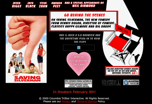
But occasionally, someone in a studio marketing department tried to come up with something clever, something that would actually make it worthwhile for fans to take the time to type in “www.savingsilverman.com” — where anyone who might be curious about the raunchy comedy Saving Silverman could watch a QuickTime behind-the-scenes video and send an “Anti-Valentine’s Day Card” to a friend. (The Saving Silverman site also allowed film buffs to sign up for updates from director Dennis Dugan, direct from the set of his follow-up picture National Security. That’s right: the Dennis Dugan.)
The list below notes some of the more distinctive and/or disappointing early attempts to go viral with movie websites, between roughly the years 2000 and 2007, before YouTube — and the movie trailers released there — became ubiquitous. Some of these efforts show genuine creativity, and a sense of the possibilities inherent in a new form of communication. Others take one of the greatest technological advancements of the modern era and use it as a moronic time-waster. History — which in this case is us — will judge which set of marketers had the right idea.
Note: Most of these pages are no longer active. If you entered the addresses in their original ads, you’d likely be redirected to nowhere, or perhaps to the studio’s VOD portal. There are a few famous older film websites still around — like Space Jam’s — but most went offline almost as soon as the DVD release. It’s only through the magic of the Internet Archive’s “Wayback Machine” that we were able to tour some of these relics — although, because of broken links and expired browser plugins, we sometimes weren’t allowed to touch anything.
Borat
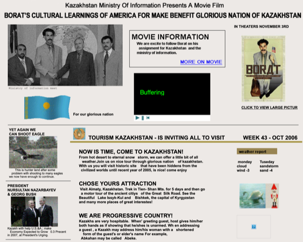
In addition to an animated Kazakhstan flag and a none-too-enticing weather report — Tuesday: Sandstorm, -4 degrees — Borat’s fake version of a tourism bureau website contains links to an actual Kazakh news agency, Kazinform. The funniest bit of shtick on the site is a Ministry of Information search window, which handily makes the following suggestions before you start typing anything: “Borat myspaces,” “Cultural Learning,” “Borat+foto+woman” and “sexytime.”
The Break-Up
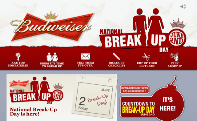
The main page for this blockbuster Jennifer Aniston vehicle doesn’t offer much worth noting, aside from a link to another page: the Budweiser-sponsored “National Break Up Day” site, which offers a downloadable countdown timer for your desktop, a list of “why I hate my ex” anecdotes and a checklist of things you can do as you prepare to separate from your partner. (A nice touch: The ad at the bottom of the screen for the dating site Perfect Match.) Break Up Day, by the way, is June 2nd. How will you celebrate it this year?
Cats & Dogs
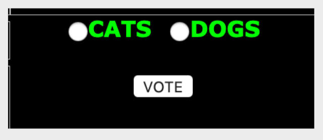
There’s something charming about the top of this page, which reads in plain green text, “Cats rule? Dogs drool? Click here to cast your vote.” Click those words and you’re whisked away to a pop-up screen with a simple choice: Cats, or dogs. Click your preferred animal and you’re taken to another screen, which says, “This web site is currently not available.” This whole process takes about 20 seconds, which is more time than anyone has spent thinking about Cats & Dogs since the summer of 2001.
Click
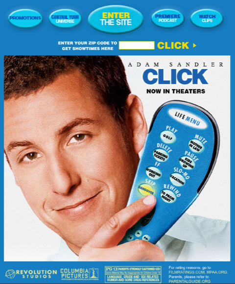
The landing page for this Adam Sandler comedy — the main site for which can apparently no longer be entered — merits a mention because of its multiple baits and switches. Although all the buttons on the star’s oversized remote control make noise, none actually do anything. Even worse, when you move your cursor over the “Control Your Universe” button at the top of the screen, the text immediately changes to “Watch Trailer.” That hardly counts as controlling the universe, Click!
Death to Smoochy
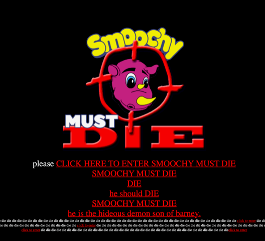
There’s a lot to love about this purposefully lo-fi site (originally available at the address “smoochymustdie.com”), which is designed to resemble the drunken rants of the Smoochy-hating kiddie show host Rainbow Randolph. Menu options include “Smoochy Is A Hack,” “Smoochy Is A Nazi” and “Rainbow Randolph Is All That Is Pure And Good In The World.” (Each of those pages offers downloadable Smoochy-besmirching images and badges.) Be sure to click on “100 Ways To Kill Him” to read such suggestions as, “3. put him in a room with me. 4. give me five minutes with him. 5. give me one good shot at him. 6. let me at him,” and, “87. overeating, like that guy in Seven.”
Evan Almighty
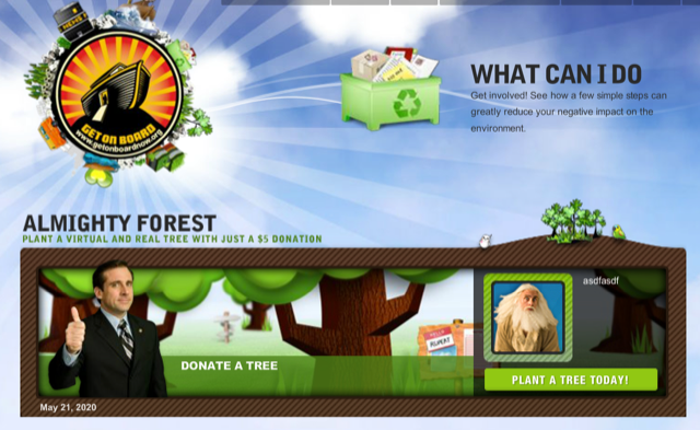
In addition to a more traditional promotional website, this flop sequel to Bruce Almighty also promoted a second site called “Get on Board Now,” which traded on the movie’s Noah’s Ark plot and environmentalist message by offering suggestions for how visitors could reduce their carbon footprint. There’s even a section of the page that lets people send eco-friendly tips to their friends and family… presumably with an attached note that says, “Y’know, that Evan Almighty has some pretty good ideas.”
Jackass Number Two
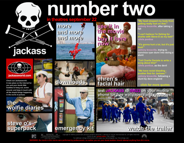
The dudes behind MTV’s most twisted stunt show were hip early on to the value of sharing their idiocy widely with fans — and to letting fans reciprocate. The 2006 site for the Jackass movie sequel comes closer than most of the items on this list to being a useful tool for selling the picture. Between the shocking quotes from the film (“We have rectal bleeding — another first for Jackass” — Johnny Knoxville), the links to the community site, “Jackass World,” and the option to type up and print out your own Jackass disclaimer warning, this page might even pass muster with the internet of 2020.
Memento
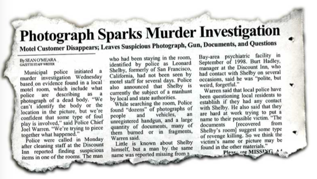
One of the few sites that’s remained active long after its movie’s original release, the Memento page (cleverly indexed under “otnemem”) calls up a mysterious newspaper clipping, describing the many mysteries left behind by the antihero Leonard Shelby during his motel stay. Run the cursor over the story and some words stand out, while others fade away. Click those words and you can see pictures and notes Leonard left scattered around his room. Frankly, most of this would be meaningless to anyone who hadn’t already seen the movie, but it’s fun for fans to scroll through. The site evokes both the details and the mood of Christopher Nolan’s breakthrough film.
Moulin Rouge!
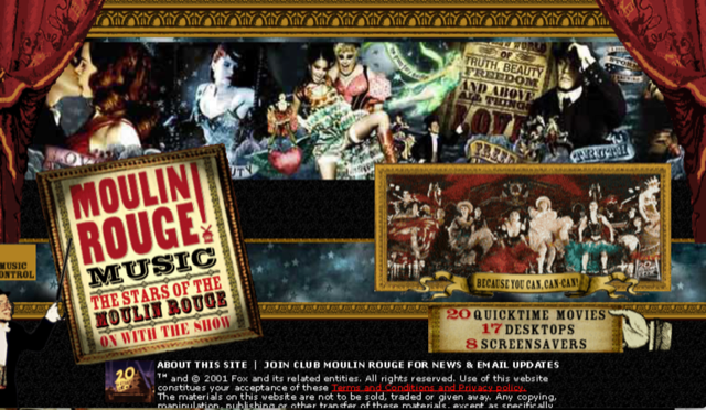
The website for Moulin Rouge! is as busy as the movie itself: full of color and movement and text. But what’s most telling about the page — which was pretty close to state-of-the-art for 2001 — is exactly what it touts. “20 Quicktime Movies!” “17 Desktops!” “8 Screensavers!” The 20th Century Fox marketing department understood what web-surfers 19 years ago wanted from a promotional website, and they served it up in dollops.
Sky Captain and the World of Tomorrow
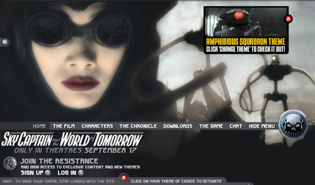
This ultra-stylish, aggressively retro action-adventure never found more than a cult audience, but give some credit to its marketing team, who seemed to understand the movie’s niche appeal. The site lets users choose different designs and sounds for their browsing experience… but only if they sign up for “the resistance” and officially log in. Other special Sky Captain features include an air combat game — though alas, even on an archived version of the page, the game is no longer downloadable. Some video footage of that game does still exist, though.
V for Vendetta
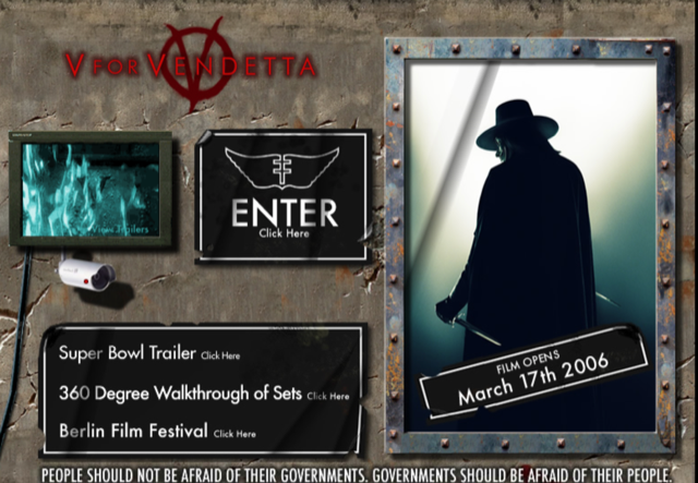
We end not with a bang but with a thud: the most mundane website imaginable for a movie based on a truly subversive work of fantasy fiction. The Alan Moore-penned and David Lloyd-illustrated graphic novel V for Vendetta is a bracing inquiry into what it means to be free in an authoritarian state. While the film shifts the analogy from Thatcher-era Great Britain to the post-9/11 age of the Patriot Act, the aim of the story is still to provoke activism. The movie’s website, though, just aims to promote its shiny surfaces, emphasizing Comic-Con panels, IMAX bookings, set design and a Super Bowl trailer. This gunpowder treason should forever be forgot.
