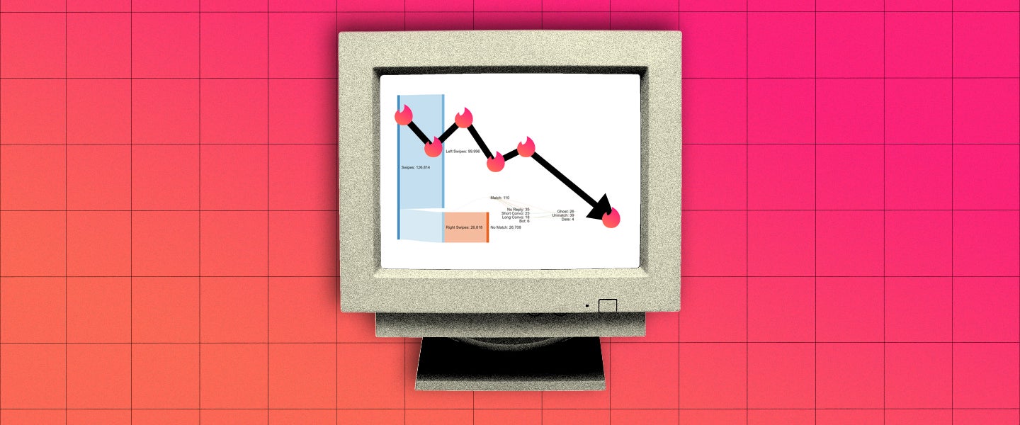
You’ve probably got a general sense of your success on Tinder — after all, you’re the one doing the swiping, and those with whom you’ve matched are right there in the app. Maybe you’ve gone on some dates, maybe not. But it’s possible to have been in the game so long that it’s all a blur: You swipe right or left without a thought — maybe swiping right on everyone who comes your way — with no perception of how much time has passed. How many people have you actually encountered on Tinder? 1,000? 100,000? Who can tell?
Well, obviously, Tinder could tell you. And actually, Tinder will tell you, if you request it. It’s relatively easy, in fact: You go to this link, log in, give them your email address, and in a few days, you’ll receive a zip file with essentially your entire history on the app. The bad news is, the file they give you just looks like a bunch of data. It’s not difficult to dissect the information, exactly, but it’s not the most intuitive or visually appealing.
Naturally, this is a problem that the Reddit group r/DataIsBeautiful likes to solve. The basic premise of the group (which has surprisingly rigorous standards for a post to be approved) is to share data presented through infographics, charts and maps. This doesn’t just make the data easier to understand — it often looks good, too.
Still, while the graphs themselves might be pretty, the reality they convey for some guys might not be.
[OC] 2 Years Of Using Tinder In 11 Different Countries As An Age 20 Male from dataisbeautiful
For almost all of the data sets shared by men, these charts are essentially visual representations of rejection. Never mind actually meeting a woman, the odds of simply being matched are between just 1 and 8 percent. According to one of the group’s members, u/FluffayPenguin, right swipes (i.e., swipes that indicate interest) for men in the group result in a match about 6 percent of the time on average (while Tinder hasn’t released any statistics regarding the average match rate of all users by gender, studies have found that heterosexual men generally have about a 15 percent chance of being swiped right on).
Both in the subreddit and as a whole, women on Tinder fare significantly better –– of the datasets shared on r/DataIsBeautiful, women had a 70 percent chance of matching with men they swiped right on.
Two months on Tinder Gold as a 21 year old female in a college town [OC] from dataisbeautiful
If you’re confused by the above charts, well, I’ll let an expert take it from here. “Many of these are what we would call Sankey or alluvial diagrams,” says data visualization expert Stephanie Evergreen. “One issue with Sankey diagrams is they quickly distort proportion. For example, this one really only tells you this dude did a lot of swiping. Everything coming off of his right swipes is so thin, you can’t really see any differences and the visualization doesn’t tell you anything anymore. Essentially, it says he swipes a lot and matches very little. With others, like this one, you can see a bit more nuance in the data visualization itself, but do we really need yet another way for men to say insensitive things about women, like ‘Was Much Fatter In Person?’”
“Bottom line, while it’s cool to have access to all of your data, to what end?” Evergreen continues. “Some people seem to use it as a way to brag about how choosy they are or to further degrade women. Others seem to use it to show off their data science/statistical know-how at the expense of telling a clear data story. While this may be unintentional, both of these uses of personal data create more distance between the visualizer and the audience — which seems to be the opposite of the goal of Tinder.”
Of course, not everyone is analyzing their Tinder data simply to lament their rejections, degrade women or ponder the fact that, even in a society where the majority of human connections now happen online, it’s still a statistical anomaly to find a partner. Instead, utilizing Tinder data can be a neat way of conducting social experiments, testing different strategies or determining whether Tinder’s paid version is worth it. For example, one user found that, as the number of Tinder’s paid users increased, the number of his matches decreased. Another user created two nearly identical profiles, the only difference being that one profile featured him with a beard and the other featured him without. Measuring the data from both profiles, he was able to determine which version of himself women found more attractive (spoiler alert: Throw your razor into the trash immediately).
I made a totally different type of Tinder data visualization: tracking declining match rates in a market of increasing paid accounts [OC] from dataisbeautiful
Even if most of the data from Tinder primarily serves as a reminder of our odds of dying alone, at least there are a few gems from the group which show that, although thousands of people might turn you down, all it takes is one “yes” to make up for it all.
Watersports fetish profile on Tinder (13 months data – 32yo male) [OC] from dataisbeautiful

