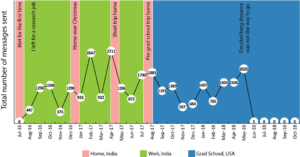
The upvotes and replies started trickling in almost as soon as Varun uploaded the graph. Like most graphs, this one had a line drawing peaks and valleys through data points that morphed up and down with time. It was a more personal graph, though, than the 25-year-old had ever made before.
The numbers on each point represented the text messages he sent to his ex-girlfriend. The stumbling decline in those numbers over the course of months symbolized the bewildering fall of the relationship. May 2018 feels like a contradiction — the 2,025 texts sent by Varun was the most since a year prior, yet the graph notes that this was when the duo “decided long distance wasn’t the way to go.” The next month’s count is the lowest since he and his ex met: Just five messages. Then there’s nothing over July, August, September and October.

“From experience I’m guessing those 5 are probably the most depressing set out of the whole time,” commented one redditor, who punctuated the end of his sentence with a frowning emoji.
“Seeing that 5 hurt,” replied another.
A third redditor wondered what the messages might say. The hypothesis: “Hey / I’m happy we finally had that discussion. / Well, not happy, you know what i mean… / You will always be in my heart no matter what, hope you find someone that makes you really happy 🙂 / Let’s keep in contact, bye.”
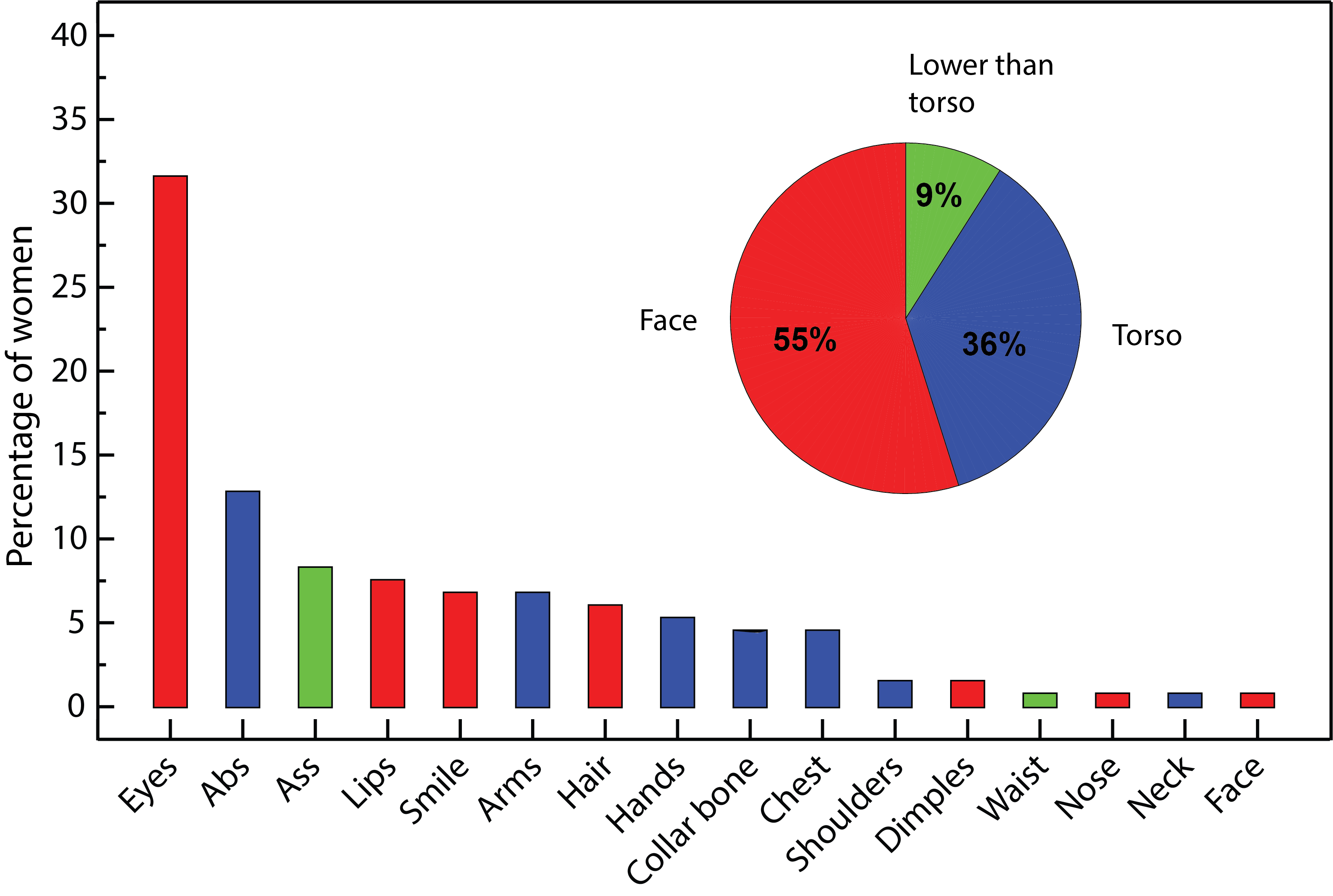
The data visualization dubbed “Death of a Relationship” has earned more than 25,000 upvotes since it was uploaded to r/DataIsBeautiful last week, with 1,200 comments and many, many more views. Varun has submitted original content to that forum before — first a log of all his drinking in 2017, then a correlation between a student’s grade and their rating of a T.A. Those received a combined 30 upvotes. Then came a visualization of what 133 online women said about what they notice first about a man physically. That garnered a healthy 633 upvotes. “My love of plotting graphs about life was not a secret in this relationship,” as he told one commenter.

Something about a man reflecting on his ex through the lens of quantified texts, however, captured people’s attention in an overwhelming way. Maybe it was the sheer relatability of trying to piece together how a romance crumbled over time, or because the simple illustration left so much room for interpretation and projection. I’d guess that it’s also because of the familiarity of seeing a man choose an analytical take on what happened, rather than one that emphasizes feelings. “It helps to be able to divorce yourself from the emotions of the situation and plot stuff dispassionately,” Varun explains over DM. “I like data that tells a story, because even if the story is sad, it can be beautiful if displayed appropriately.”
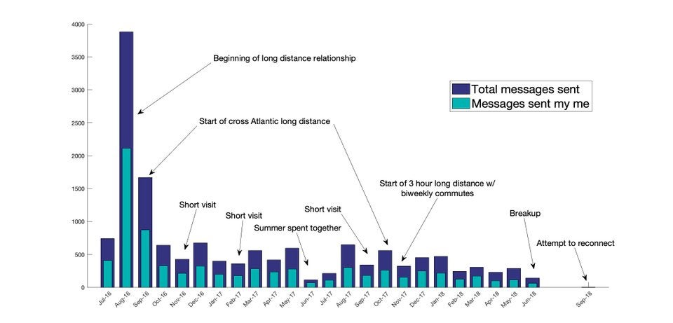
Varun’s work obviously struck a chord with Micah, a 20-year-old engineering student in Philadelphia who broke up with his girlfriend in June. He created his own visualization in a three-hour sprint after seeing “Death of a Relationship,” tweaking the graphic format to depict not just the number of texts he sent, but the ratio of that to ones he received. He posted it to Reddit the next day, unsure of what to expect. Like Varun, he was a longtime member of r/DataIsBeautiful and used exported chat logs from WhatsApp to count up the texts. And also like Varun, his graph went viral, hitting the front page of the site and racking up 23,000 upvotes.

Micah’s relationship lasted for two years, with a majority of it being long-distance. In the process of harvesting data for his graph, Micah debated whether to go through and actually read the messages themselves. Ultimately, he stopped himself: “I knew that wasn’t healthy,” he explains. Instead, he found solace in working with numbers. “I don’t think the decline in numbers necessarily shows a decline in romantic life,” he says, noting for instance that some dips were the result of being together in person rather than talking digitally. “That first month is… pretty obvious in terms of our connection. I don’t even remember texting that much.”
There is a touch of heartbreak in his graph, as it shows that two months after the breakup, he tried to reconnect with his ex — to no avail. He also now attends the same university as her, after all that time apart — a situation that churns up uneasy emotions when he lingers on the irony. At least the success of his Reddit post, and the sympathetic comments it elicited, was a heartening boost. “I think the reason why it got so many views, over 600,000, is just that longing feeling of wanting to find meaning in a breakup. You’re just all of a sudden alone,” he says.
We innately understand that faltering communication is a red flag in relationships, which is one reason why these visualizations hit so close to home, says Jin Kim, a licensed marriage and family therapist in L.A. It’s also typical of what a guy might do to cope with a breakup, Kim notes. Many men find it easier to interpret relational issues with a quantitative, analytical approach, he says — a notion backed by research that shows that gender differences are largely impacted by social forces.
“These guys are clearly very analytical,” Kim says. “But I also don’t think of a woman doing this in the process of a breakup. Women typically are more expressive with feelings and process relationships by talking with other people. Of course, it’s not true of all men, but generally, men aren’t cultured to talk about their feelings as much. And I’m sure there was a reason for these young men to start such a project, even if they say it’s not really to cope.”
Micah admits that he had trouble finding outlets for his emotion after his split. “I tried talking to friends, but guys say a bunch of things and just expect me to be one way. You know, ‘Oh, it’s been two months, get over it,’” he says. “I didn’t think quantifying the data would tell me everything. But it helped me get through it.”
Yet despite the positive reaction on Reddit, he’s been hesitant to show many of his irl friends his graph, joking half-heartedly that it would seem “pathetic” — an example of how men silence themselves because of a humming anxiety that their vulnerability will come across as weakness, observes Amie Leadingham, a master-certified relationship coach in L.A. In a counterintuitive way, many men don’t see their friends and family as the audience to bare emotion to. Instead, they can be part of the reason for the insecurity, she says. “I personally think it’s important to feel emotion and work through grief,” Leadingham adds. “But even with these visualizations, these men have been courageous and stepped out of a social norm, and now they’re seeing how relatable it really is.”
But not everyone feels the same. Stephen Few, a noted expert in the field of data visualization, responded to my questions about how he’d approach a breakup graph by dismissing the assignment altogether. “Trying to quantify qualitative experiences is generally a mistake,” he writes. “Perhaps the real lesson here is that relationships are not primarily built on texts, and they certainly cannot be understood based on texts alone.”
That seems needlessly harsh, though. Shifts in communication, especially the tangible, trackable kind like phone calls and texts, are what so many of us remember when we reflect on how our relationships began to fail. And part of the online response has been questions and suggestions from people on how to contextualize the decline of a relationship with more data — perhaps by reviewing the duration and volume of phone calls, or by processing the content of texts to find ones that mention triggers like “love,” “happy” or “miss.”
For now, however, the basics have more than sufficed for Varun and Micah. “Breakups are hard, and I’m glad this post provided a forum for a lot of us to express that,” Varun concluded on his thread. And while it’s gonna take some time for Micah to feel like his normal self, he’s grateful that he found Varun’s post and decided to spend some of his own time mulling over an important era of discovery and growth in his life.
“The graph has given me some kind of closure. Not the closure I wanted,” he says. “But the relationship was a great time. Working with this data made me think of that, too.”

