We recognize Hollywood films by their lead actors and actresses and the directors behind the camera. But for Maria Suarez-Inclan, a 24-year-old illustrator and graphic designer in London, the art of a film can be found in a movie’s sets and props.
Suarez-Inclan has designed eight posters featuring props and iconic images from the films of Steven Spielberg, Quentin Tarantino, Wes Anderson and other favorites. In the Spielberg poster, you’ll find rows and rows of memorable imagery from his blockbusters, such as Indiana Jones’ trademark hat, the lighter from Schindler’s List and the wooden gates to Jurassic Park.

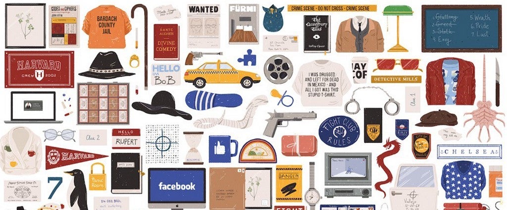
The David Fincher poster includes the soap bars found in Fight Club, a Harvard flag representing The Social Network and the cover of The Canterbury Tales which played a role in Se7en.
“These objects are sometimes really important for the films,” Suarez-Inclan told MEL. “If Tarantino hadn’t chosen a Pussy Wagon or a yellow suit, Kill Bill would be completely different—or at least it would be remembered differently.”
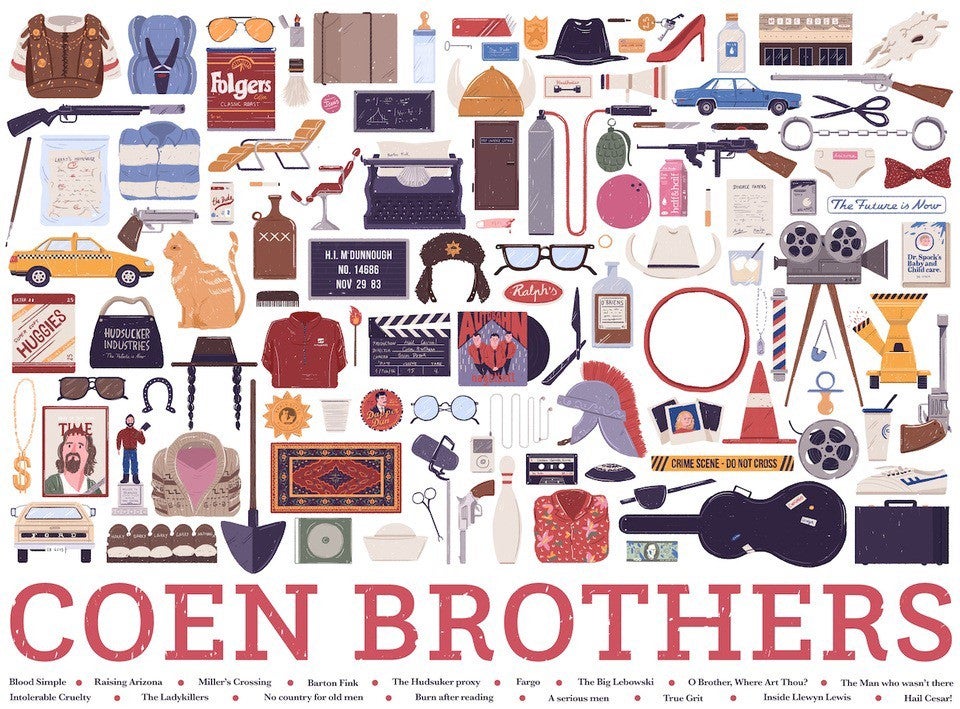
Staring at the posters triggers waves of nostalgia for these Hollywood classics. The package of Huggies on the Coen Brothers’ poster, for example, instantly summons Nicolas Cage’s classic line from Raising Arizona: “I’ll be taking these Huggies and whatever cash ya got.” I didn’t have to see Cage’s masked face; an object is strong enough alone to surface those scenes long imprinted in my memory.
What stood out to Suarez-Inclan most out of all the objects she drew was Elliott’s bike in E.T. “It’s not that special, just a bike with a white box in the front. But I feel like it represents the whole scene in which he flies in front of the moon and that, to me, is one of the best scenes ever.”

Suarez-Inclan, who is originally from Madrid, says her passion for illustration began long before formal study. “When I was a kid I used to draw everything, I remember having a notebook where I drew every single Pokemon and some invented ones.” After earning a degree in graphic design and psychology, she’s worked as an art director out of Saatchi & Saatchi’s offices in Madrid and London. Outside of work, she’s created a number of projects translating pop culture ephemera into art: a Game of Thrones map of Westeros and Essos for a gallery show in San Francisco last June; a poster of characters for American Horror Story: Freak Show; a series of illustrations of classic Hollywood heroes and villains, from Freddy Krueger to The Joker to Captain Jack Sparrow.
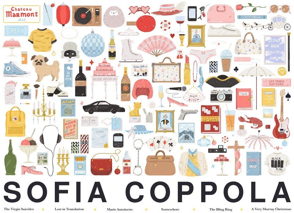
Still, her most oft-cited work is the collection of props and images from films, curated by director. “The reason I thought it was a cool idea to illustrate [a director’s props] all together… is that it is a really good way to see the color palettes directors use for their movies. This is completely obvious if you look at the Sofia Coppola one.”

Indeed, the poster’s light blues and soft pinks make a stark contrast with Tarantino’s bright yellows and other bold colors. Seeing how movie images represent a director’s vision can go even a step further. Tarantino’s objets d’art are heavy on violent weapons such as swords in Kill Bill or guns in Reservoir Dogs, but despite the horror peppered throughout Spielberg films (think Schindler’s List, Jaws), imagery for his films spotlight other kinds of frightening attackers. A simple image of a cobra evokes that pit of slithering reptiles trapping Indiana Jones. Did you just shudder too? You’re not alone.
Thee effect of these posters is that “feeling of wanting to keep something from the movie with you,” she says. “I want the viewer to remember how some movies made them feel.”
