In its infancy, Soylent — the venture-backed, soy-based meal replacement startup — has been able to subsist off the hype generated by its Kickstarter, its attention-getting founder and its claim to have disrupted the food-industrial complex. Soylent would free us from the pesky task of having to ingest food, ushering in an era of unfathomable productivity, it said.
The idea is revolutionary when you consider how integral food is to our social lives. Holidays, client meetings, dates, lunches with co-workers — they all revolve around communal consumption. We’ve programmed food breaks into everything from work to wedding receptions.
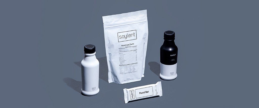
But novelty can only get Soylent so far. If Soylent is to ever realize its goal of becoming a widely used meal replacement brand, it has to broaden its appeal beyond its tech bro fanbase. To do so, Soylent recently expanded its product line beyond its signature drink, adding a Soylent-coffee mixture called Coffiest, and its first solid food product, a food bar it calls … Food Bar.
Equally important to that growth is how Soylent chooses to market its new wares, which is why MEL has conducted a highly unscientific breakdown of Soylent’s new product branding.

Coffiest
Adjectives rarely make for successful brand names. A cursory look at Interbrand’s annual list of the 100 most recognizable brands, for instance, reveals that none of them use adjectives for their names — they’re all nouns, such as people’s names (Disney, Tiffany, Ford), places (Amazon, acronyms (IBM, BMW, SAP, UPS) and tech industry portmanteaus (eBay, Facebook, PayPal).
Soylent, however, chose to call its half-coffee half-Soylent blend Coffiest, as in, “the most coffee-like coffee beverage on the market.” A pedant might argue that a plain cup of black coffee is far more coffee-like than coffee mixed with Soylent’s chalky beige sludge, but let’s not resort to hair-splitting.
The confounding name aside, Coffiest’s matte white-and-black packaging is v chic, per the arbiters of chicness at Vogue. And the liquid pouring from the Coffiest botttle in this photo looks legitimately appetizing (like chocolate milk), whereas Soylent’s product has the look and mouthfeel of semen.
Soylent proponents have long extolled the virtues of cutting the drink with coffee, actually. Now Soylent combines them for you in one handy morning meal replacement drink, perfect for the on-the-go man or woman of business.
It’s clear that Coffiest is intended for a more general audience than Soylent proper. Mixing Soylent with coffee makes it more palatable and comprehensible to mainstream consumers. And the appeal to a busy businessman makes sense since Soylent’s chief selling point is convenience.
Food Bar
But Soylent’s Food Bar is another matter. I’m all for minimalism, but there’s a line between elegant design and something suspiciously devoid of branding, such as Food Bar. The Food Bar packaging is as sterile as a surgeon’s table.
Food Bar? That sounds like someone trying a bit too hard to convince you that what you’re about to eat is, indeed, food. Oh, no, this actual food. It’s good for you and definitely not cockroaches we’ve passed through the meat grinder.
Anyone with experience in advertising/marketing/media can attest to all the time and money wasted on group meetings where you try to identify and evoke something’s “brand.” So I’m consistently amazed at the basicness with which so many products get advertised. The billboard for Man With a Plan, CBS’s new sitcom starring Matt LeBlanc, features the catchphrase “LeBlanc is LeBack.” I guarantee it took eight copywriters, four months of market research and millions in billable hours for that groan-worthy tagline to get approved.
Self-Help Patrol: Man Cannot Live Off Soylent Alone
This looks like food only an astronaut would eat — like something a 1950s sci-fi writer dreamed up when thinking about humans would eat in some dark, distant, dystopian future, when all we’ve reduced human nutrition to a single food unit. Here is your daily Food Bar. That will be seven Intergalactic Federation Credits, please.
Like Coffiest, Food Bar plays up the portability and convenience angle, showing how easily it fits with your other travel items. But it might take more than an Instagram-worthy tableau to convince people to choose Food Bar over Nature Valley.
Literally everything else on this table looks more inviting than the Food Bar.
Which I suppose is kind of the point. Soylent isn’t food as we’ve traditionally come to think of it — it’s the anti-food. It’s specifically aimed at replacing the foods we usually eat and the corresponding annoyance of having to plan and prepare meals. Soylent is streamlined, and Food Bar represents that extreme mentality perhaps too well. Because if Soylent is ever to widen its audience, it has to appeal to people for whom food is not some needless distraction, but an enjoyable part of life.
